Brief: This project is an infographic I created for ContentSquare, which is a global, enterprise-level UX optimization platform.
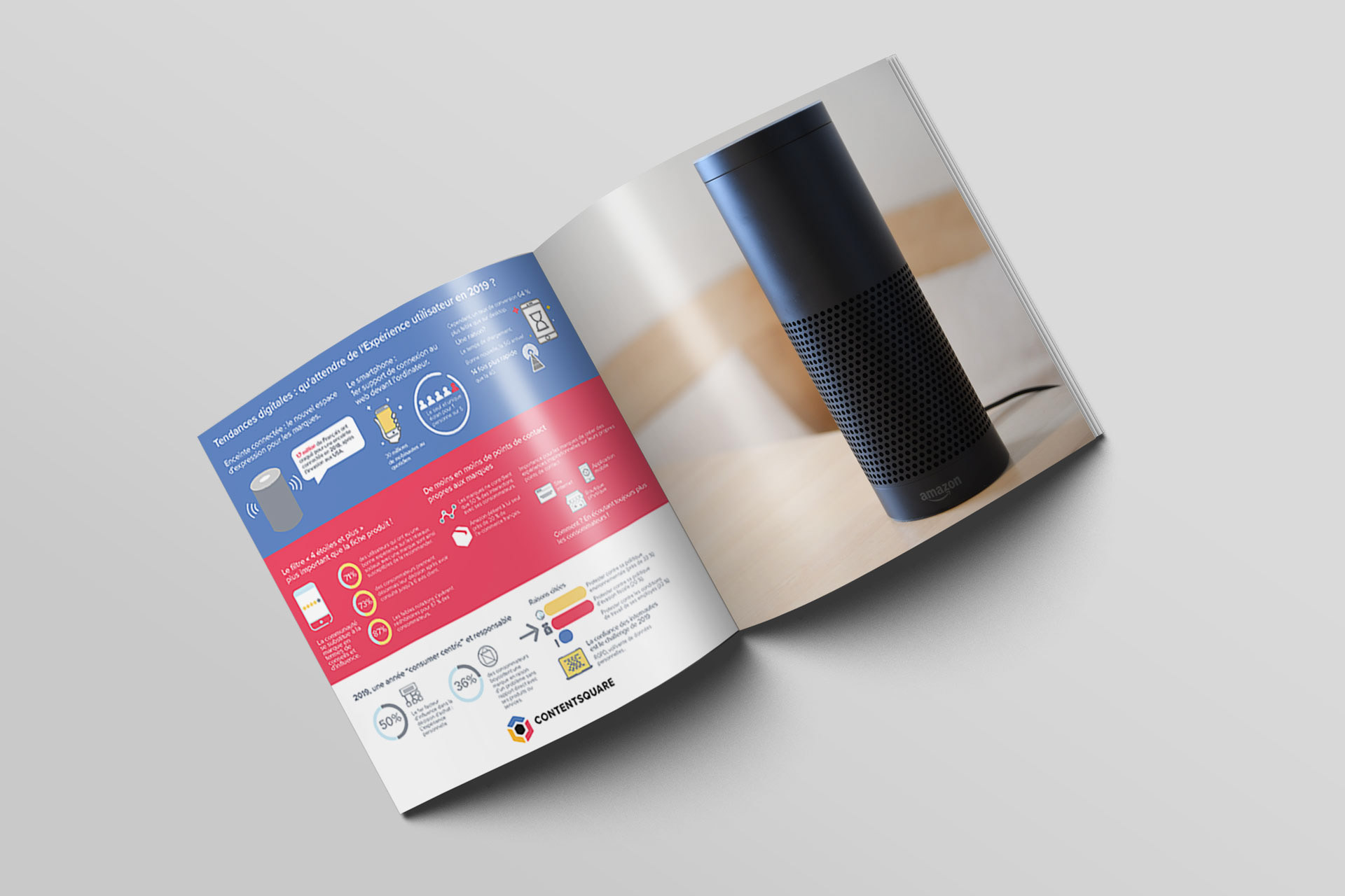
Insight: This particular infographic was centered around mobile and technology use, as well as the use of what the French call “connected speakers,” or what we as Americans call “smart speakers.”
Method: I chose to utilize ContentSquare’s primary color palette (red, yellow, and orange), and divide the infographic into three sections. This allows the reader to read each row of information, and guides the eye along the page.
Takeaway: I had a lot of fun creating whimsical illustrations for each section, and some were more challenging than others to illustrate- for example, abstract concepts such as consumer engagement.