For the first project, a logo, I first looked at who would be attending my conference. The demographics were young UX/UI designers, who like food, drink, and nightlife, sports, art, history, and music. They are attending the conference because they want to become better designers, learn about trends, and make connections in the industry. They are very creative, free-thinking, and influenced by trends and peers. The types of sessions they would attend while at the conference are: music, happy hour, workshops on game design, human-oriented design activities and workshops.
The mission of the conference is to educate, entertain, and bring together a community of designers to share an experience, without the normal stress and high-pressure environment of a traditional design conference. This conference is different from other Design Research conferences because it isn't boring or stuffy, it is interactive, and there are fun experiences as well as educational ones. The targeted audience of the conference is young professionals as well as students who are in the field of UI/UX. Some adjectives to describe this conference are casual yet sleek, high energy, and well-reputed. This conference will have sessions and workshops centering around the humanity aspect of human-centered design, from new and avant-garde startups, as well as more well-established companies. Written and verbal messages that can be used to communicate the main objectives of the conference are bright, minimal colors, abstract/geometric shapes, high clean lines, and high contrast in photography.
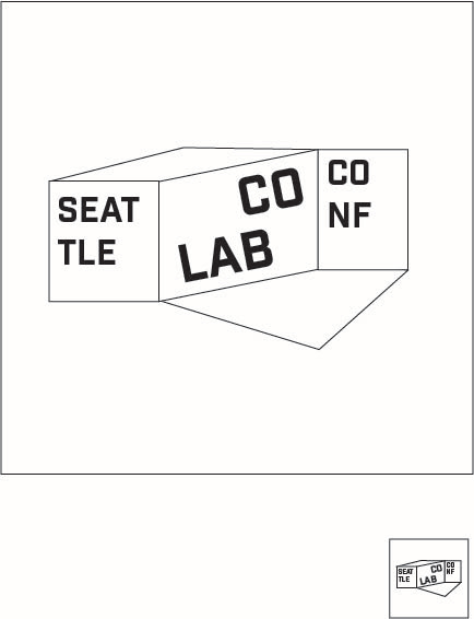
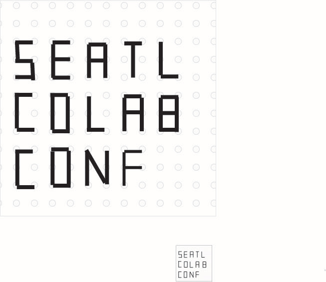
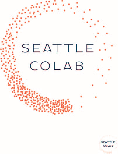
Below you see the three possible logos I created for the conference. The first is geometrician abstract, the second conceptualized around the grid and coding-style elements, and the third symbolic, with the small marks or dots representing individuals in community. To think of my conferences name, Colab, I thought a lot about connection, collaboration and connection- and combined that with "lab," as in "laboratory", which brings to mind elements of workshops and learning.
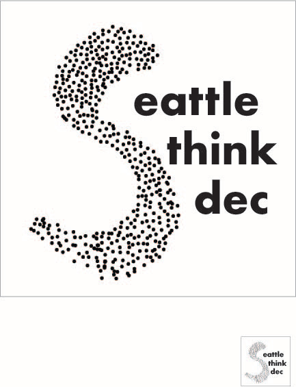
Below, my final logo in color, I decided to go with the third concept, but with some helpful critiques, changed the 'S" shape into a simple circle that is gradated from heavy (lots of shapes) to lighter (with fewer shapes). The circle represents community and connection, and I later changed the dots to triangles after another critique.
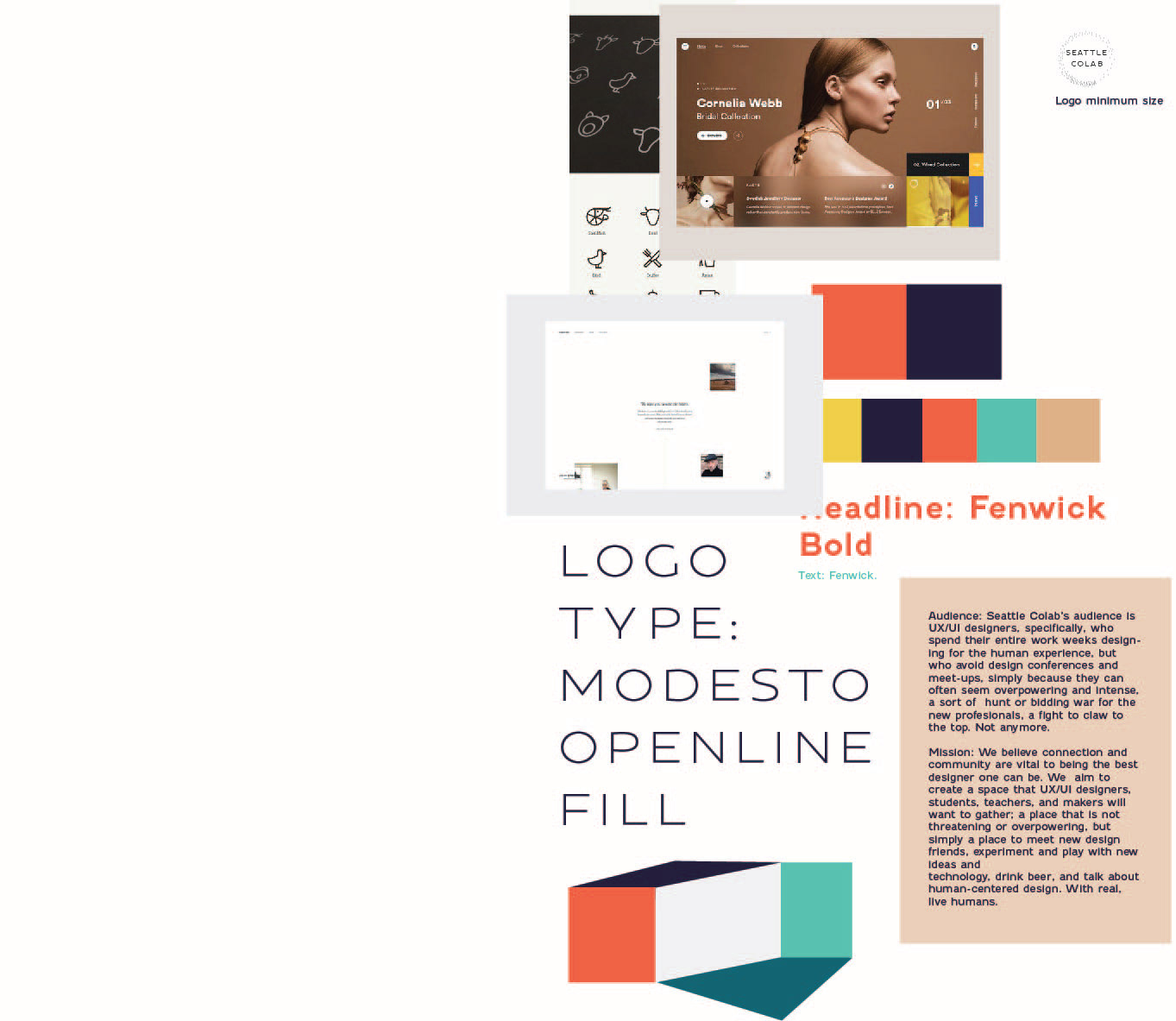
Below, my "mood board" of sorts for the conference materials as a whole. I wanted to emulate the simple, clean and elegant yet playful feeling of Scandinavian design, choosing sans serif fonts, paired with bold and cheerful colors.
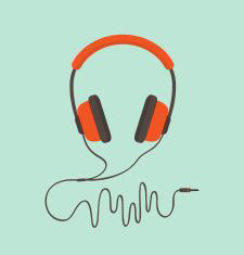
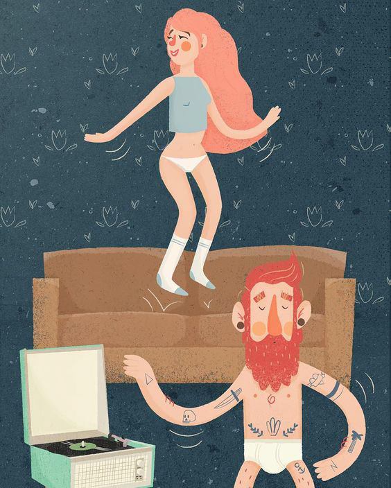
Below, some inspiration on the style I wanted to emulate for the illustration in my conference materials: whimsical, yet clean and sophisticated.
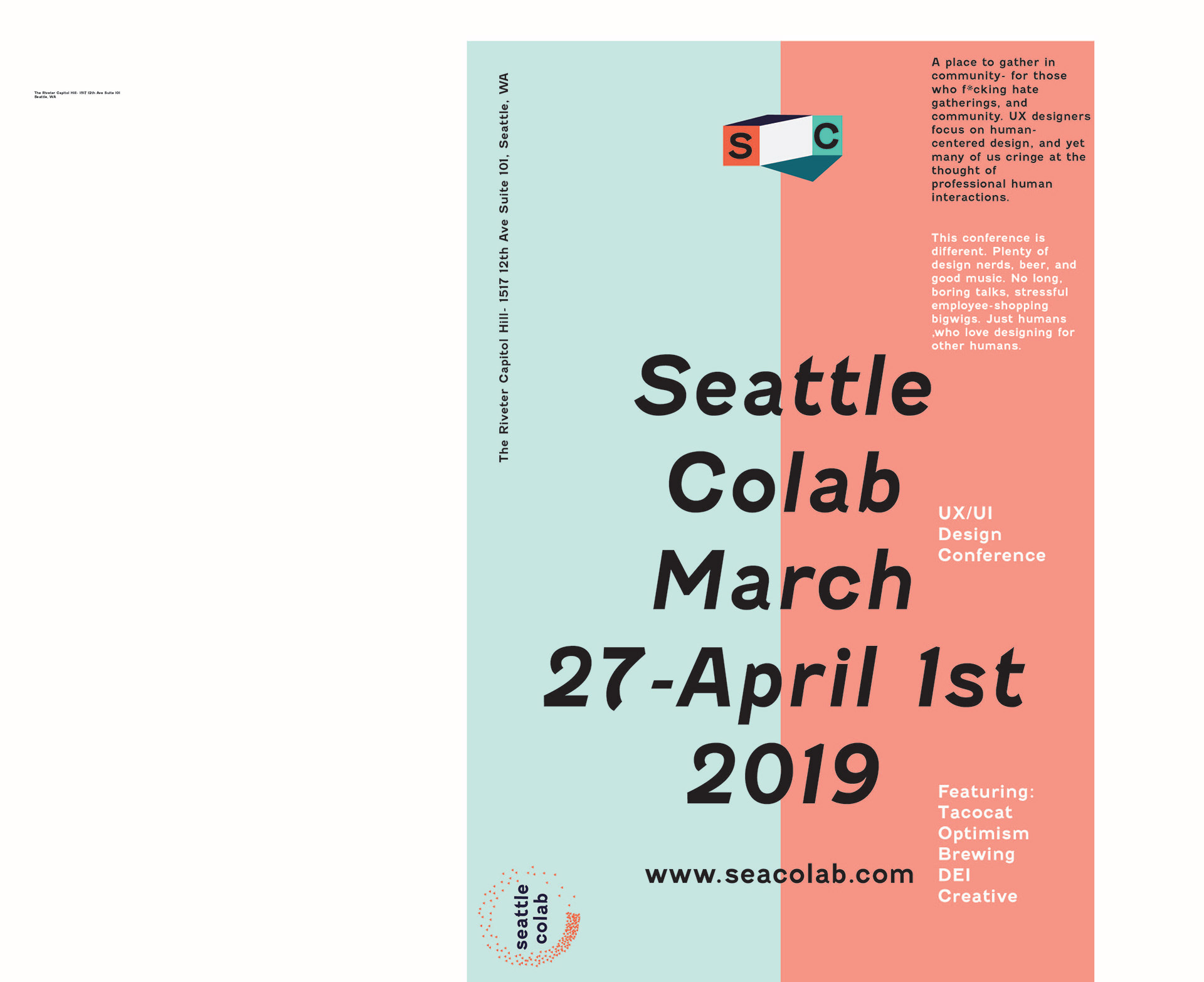
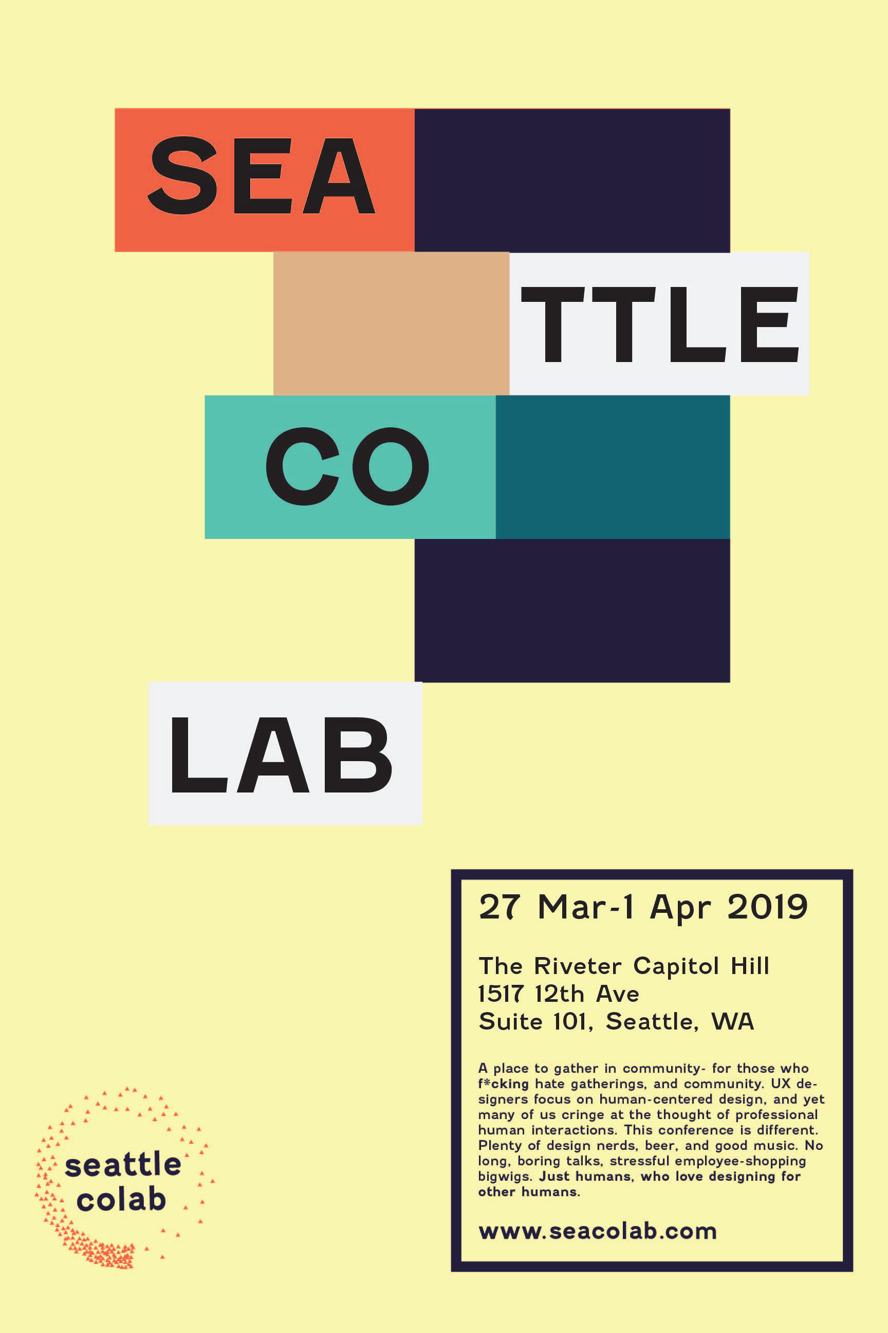
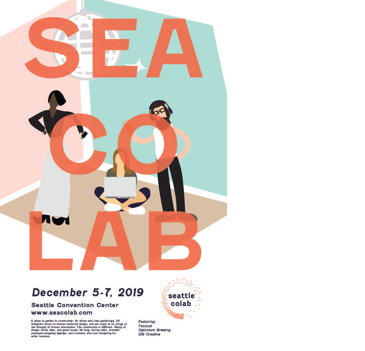
Below are my first three drafts for the poster project. The first is very structured, follows the grid well, and is rather simple in structure. The second is playful and illustrative, and the third involves the geometric element that I wanted to use.
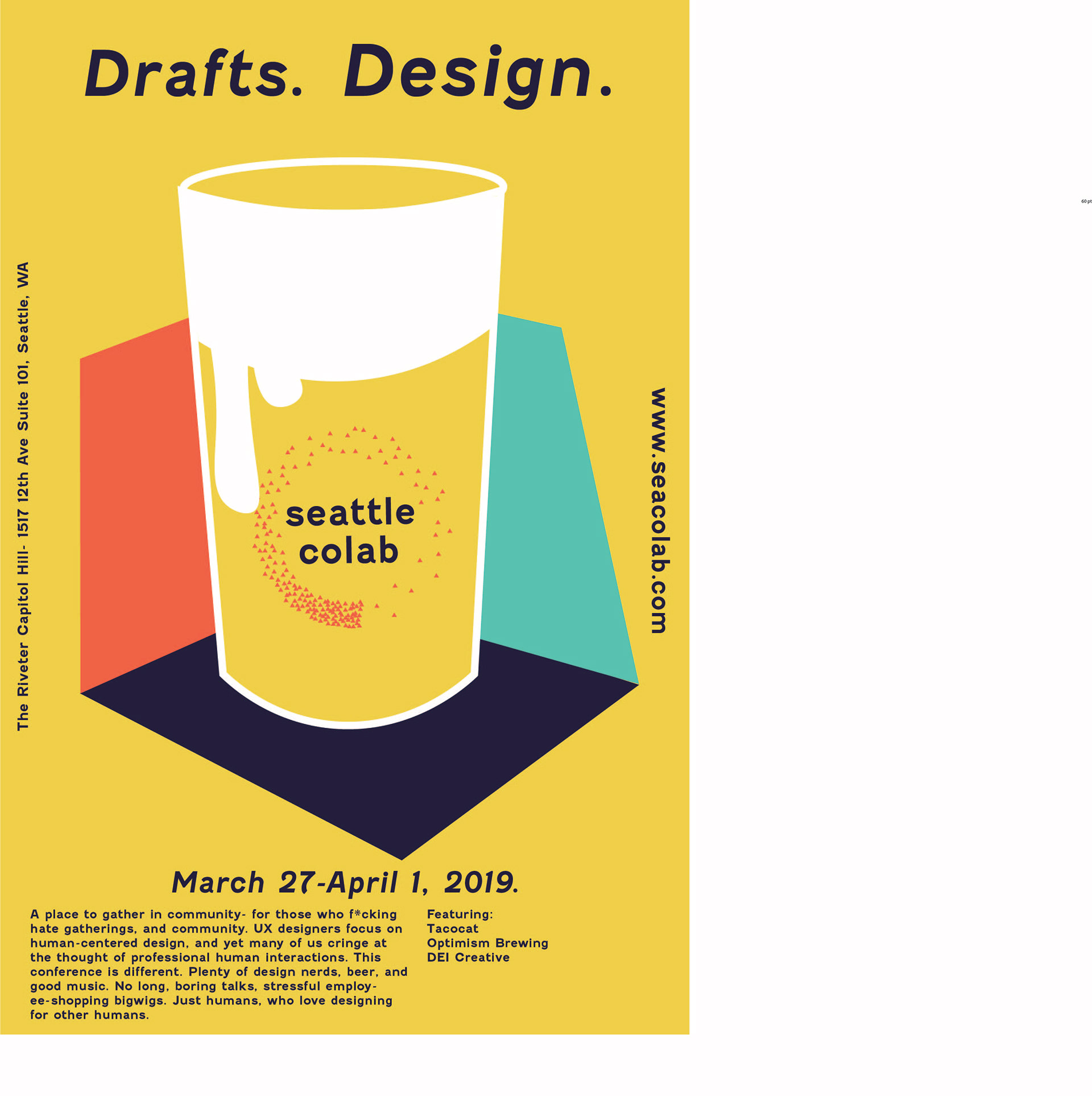
After many critiques, I realized that certain aspects of each poster were working, while others were not. The beer illustration was too misleading, so I instead chose to illustrate several individuals listening to music, dancing, and working on a laptop. The geometric element was kept, though at a larger scale.
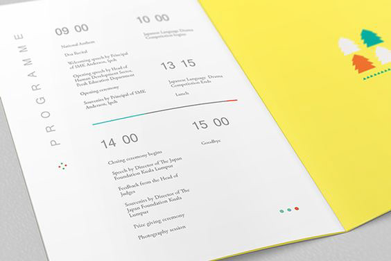
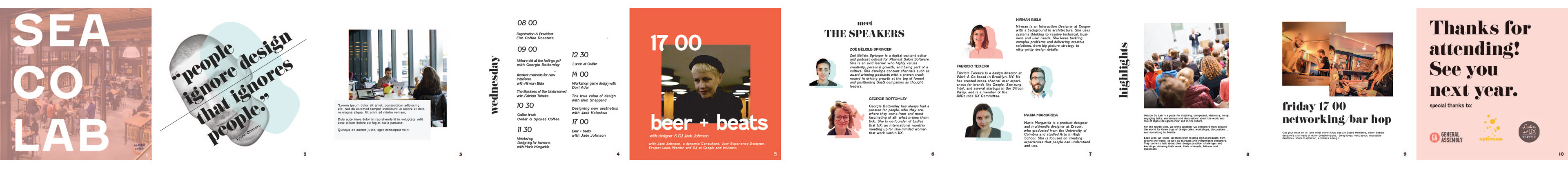
Below: The layout of my booklet. I incorporated a lot of elements from my poster, trying to keep it in the same visual theme. The photography is all stock, but the speakers are real UX/UI designers from around the world.
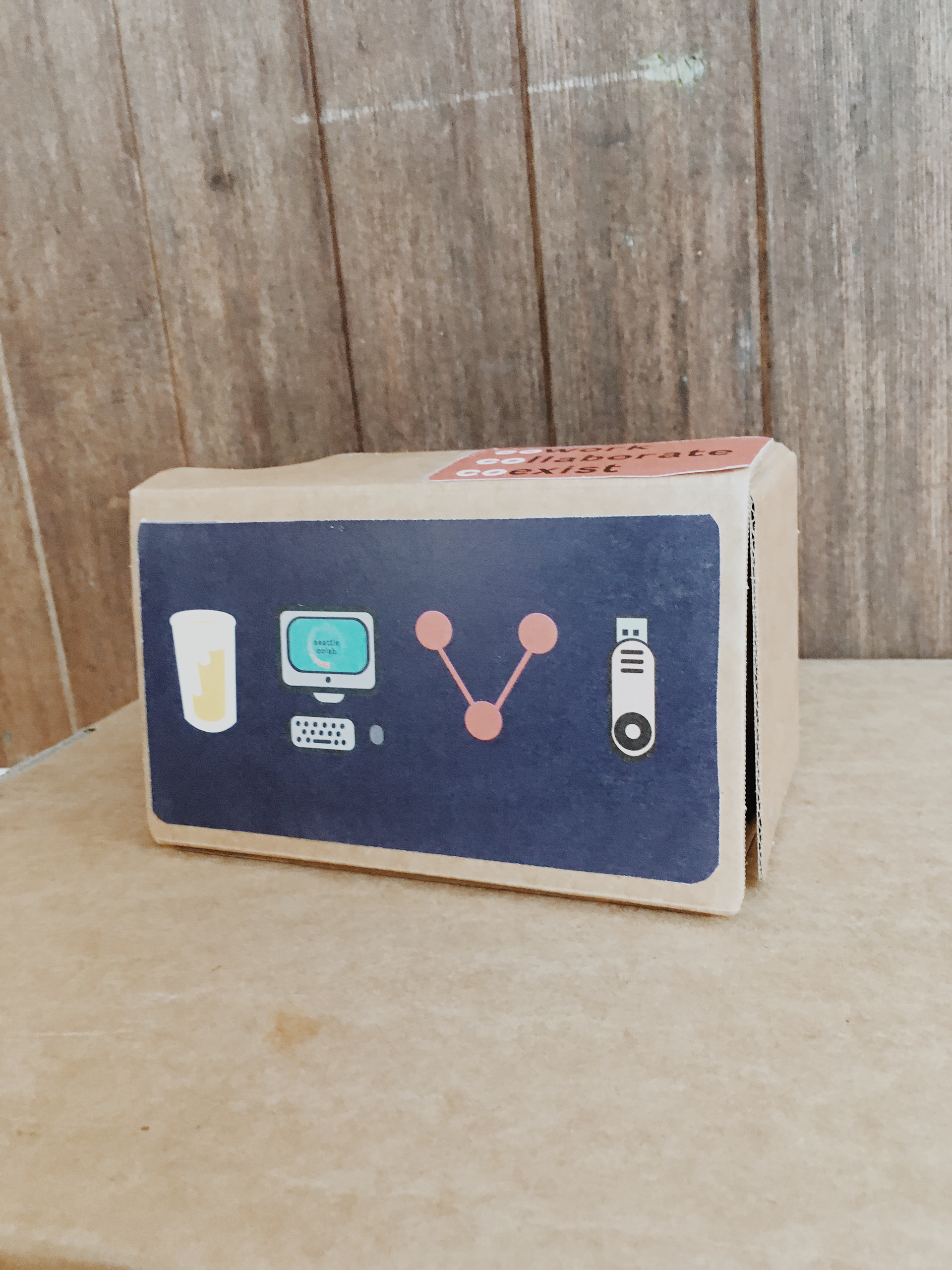
Below: My unconventional marketing. I plan on spray mounting this element onto Google Cardboard, These would be given out as part of "swag bags" at the conference.