
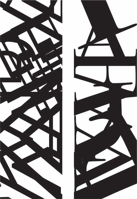
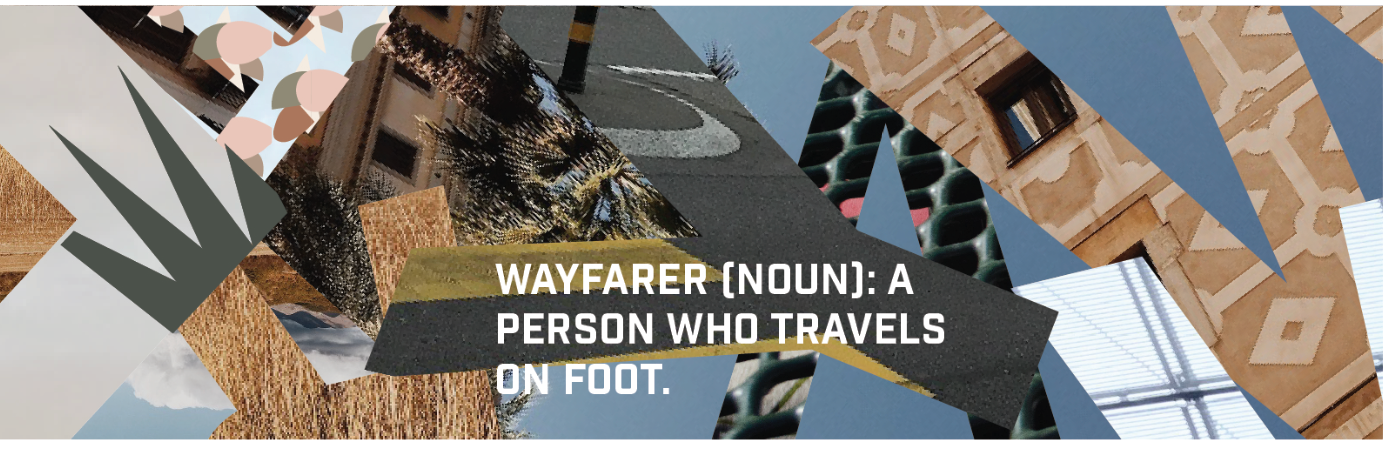
Project One
For this project, my word was "Wayfarer," which simply means, "a person who travels on foot." I drew inspiration from my own personal love of travel, which doesn't necessarily stem from tradition or family, but is something that I have attributed to my own culture. This project was probably the most difficult of the three, as creating an abstract pattern was not something I was accustomed to- but I enjoyed creating a pleasing visual composition of the intertwining letters. As you can see in the first image, the composition I first made was much too oversaturated and visually heavy, so I learned to create balance and leave proper white space between the letterforms. The photos themselves come from my trip last year to Europe, but there are a few from around Seattle as well.
Travel is in my culture because I never have any money in my bank account, because as soon as I save up enough, I’m off on my next trip. I’ve got lots of maps, on many of which I mark where I’ve been, and where I want to go. I know how to live out of a backpack, for months on end. I’m no stranger to sleeping in a train station, or an airport, or a stranger’s home. The best part of living in Seattle, and of its culture, is feeling like I’m always travelling- the vibrant and beautiful mix of cultures and languages means I am always seeing other parts of the world, even when I’m living my small, uneventful life at home.
Project Two
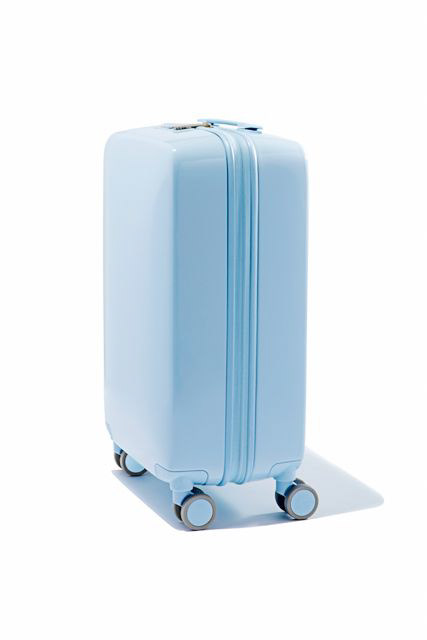
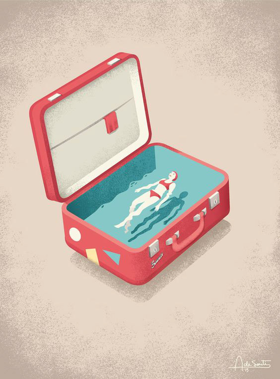
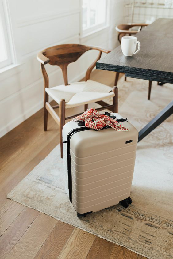
Above: Some of my inspiration photos for this project. I looked at the basic forms of a suitcase, what minimal aspects I needed to include to ensure that meaning was well-translated, how I could abstract the forms to fit a shape, and of course the type of suitcase I wanted to illustrate- I chose a more modern rolling style, like the one in the last photo, as the vintage-style clasping suitcase is a bit oversaturated in illustration/visual representation.
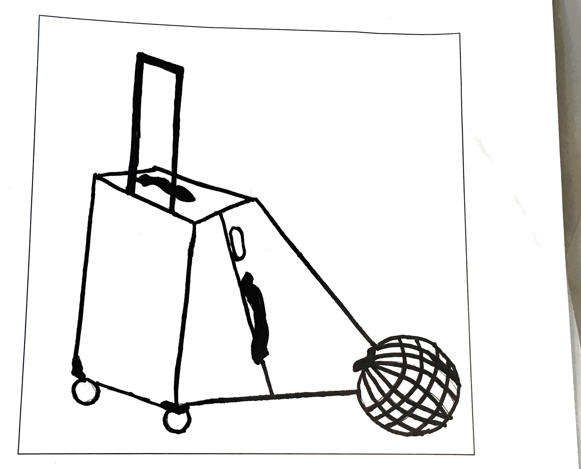
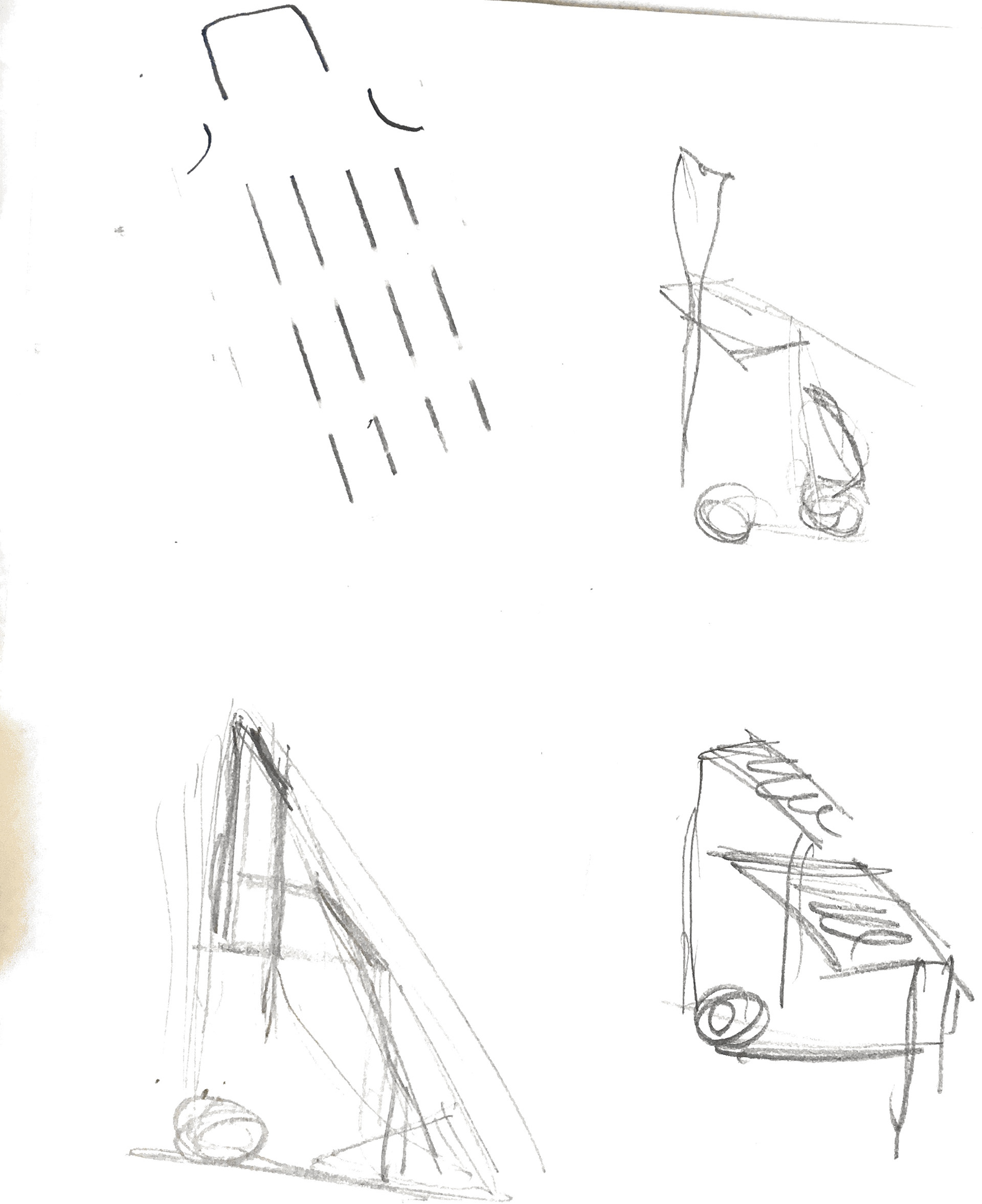
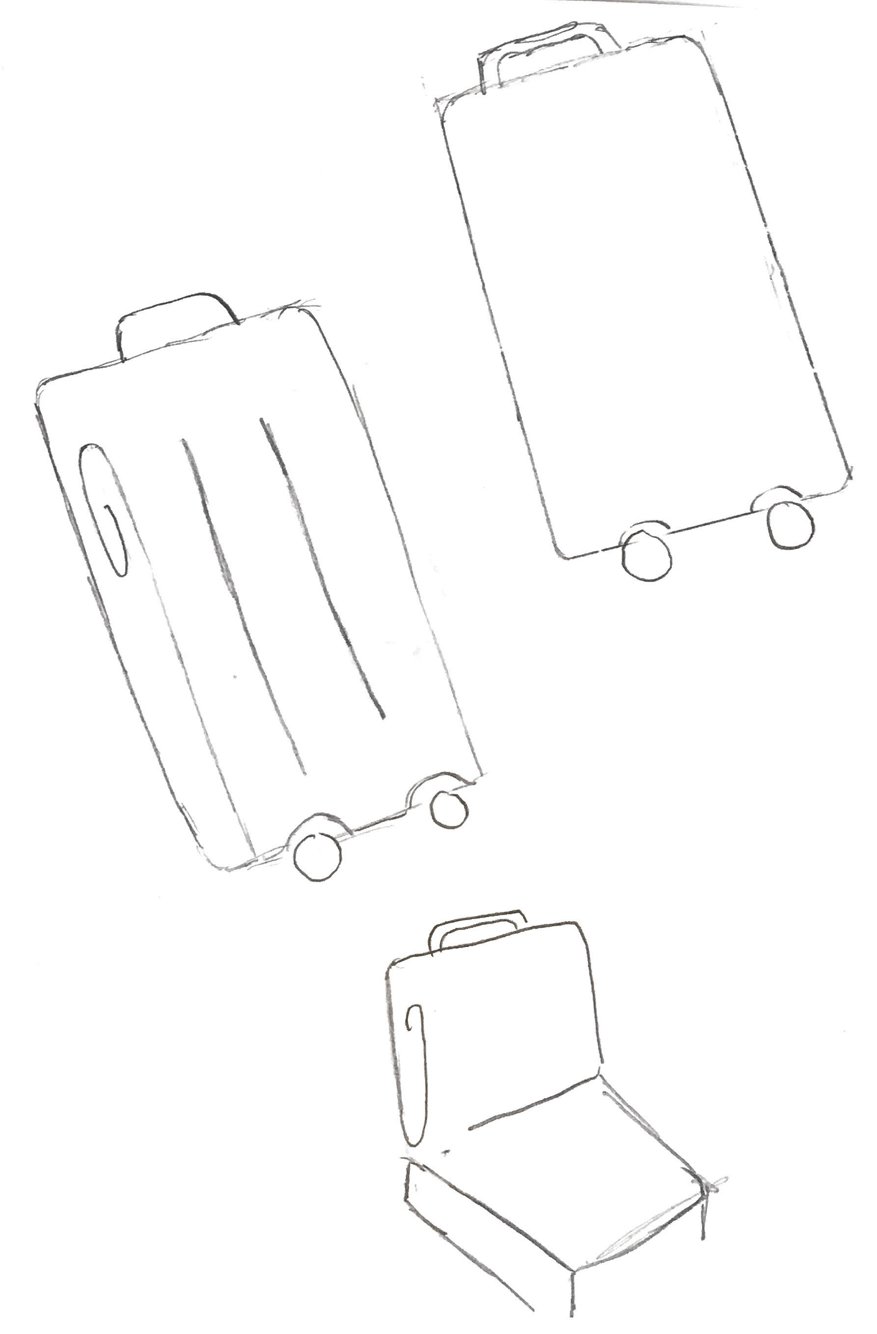
Above: The sketches of suitcases in various positions I did (open, laid flat, turned sideways). I experimented with removing elements, abstracting pieces (the swirl in the side of the suitcase to represent depth, which I ultimately didn't keep in my final piece but really liked how it looked). The top-most image (the one in Sharpie) is my final sketch- but I continued to streamline and abstract it digitally- and removed the globe.
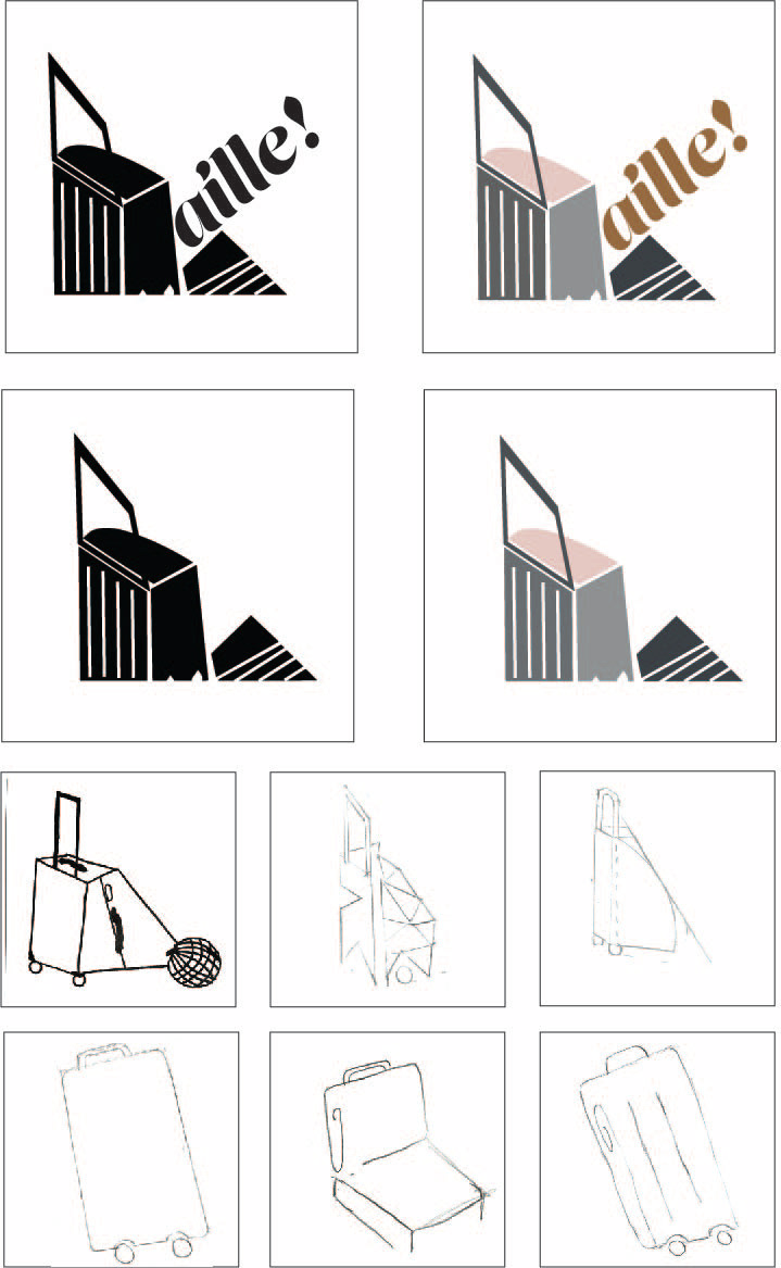
Above is my final piece for this project- it shows the lockup of my logo in color, black & white, and with the word (wayfarer is much too long of a word to fit appropriately with my logo- although in retrospect I might have put it at the bottom, or maybe somehow connected it to the suitcase?), along with six of my original sketches.
Overall, this project went much more smoothly than the first. I really enjoyed creating my logo, I think the slanted angles of the handle and its abstracted shadow create really great visual interest, and the implied triangle shape that Karen helped me create is really dynamic. In retrospect, I would love to explore what it would have looked like had I made the suitcase at an angle (to create more of a triangle that is balancing on its topmost point) to create even more visual interest and abstraction.
Project Three

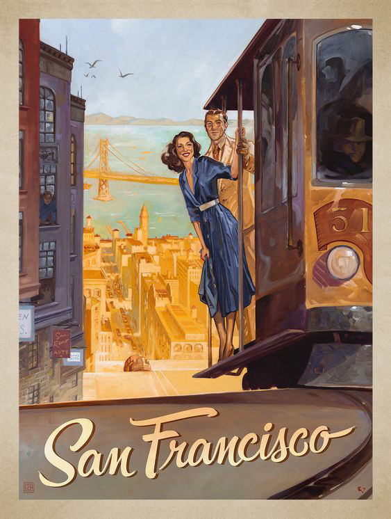
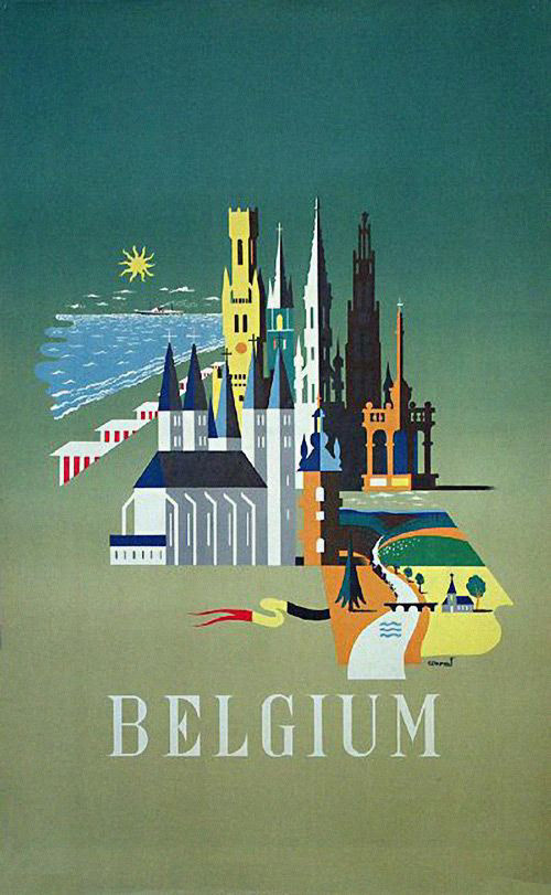
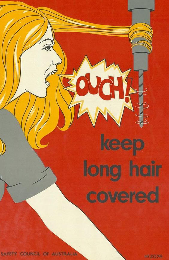
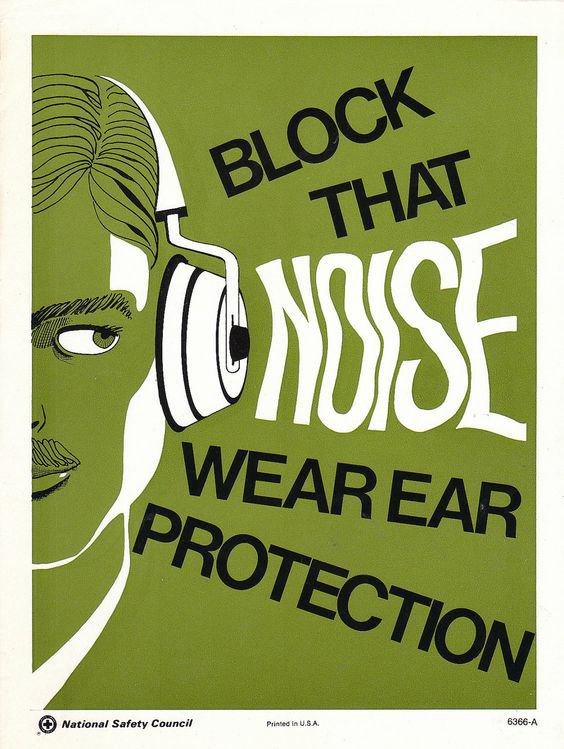
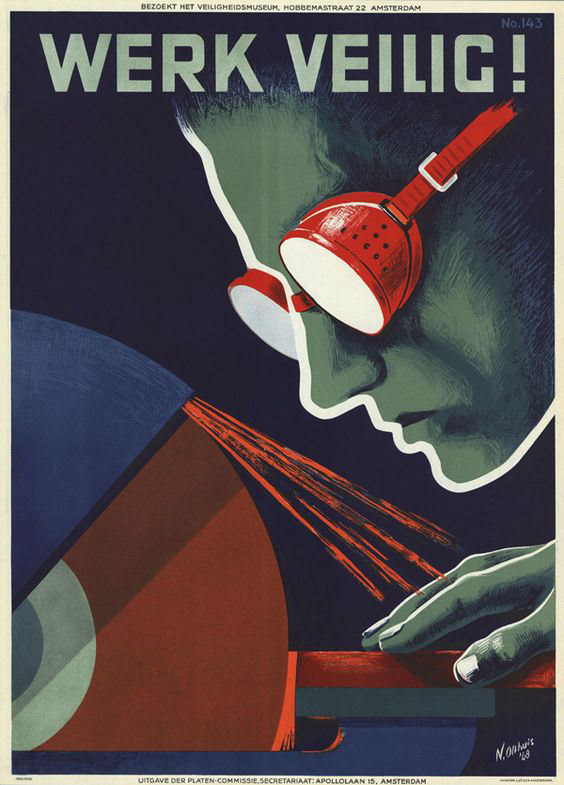
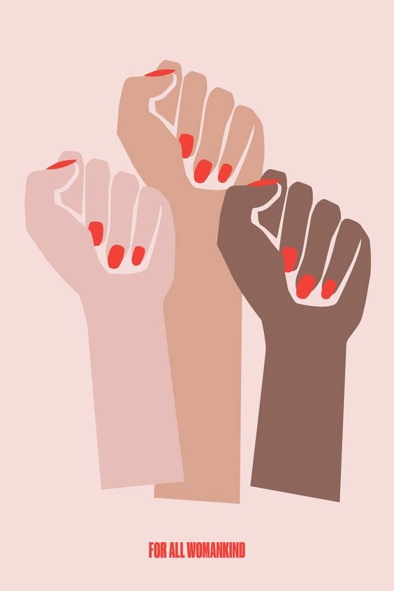
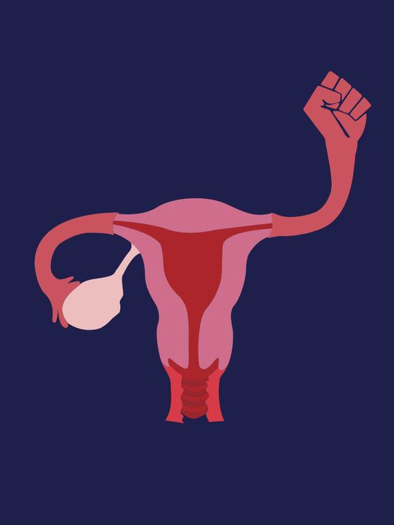
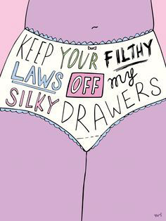
Above: Numerous inspiration examples I studied when I was thinking about what I wanted my poster to look like. I first used the color scheme similar to that of the last illustration (purples, pinks, and other pastel colors) but received the critique that it felt too feminine, so I toned it down and changed it to a cooler, more neutral palette of greens and blues.
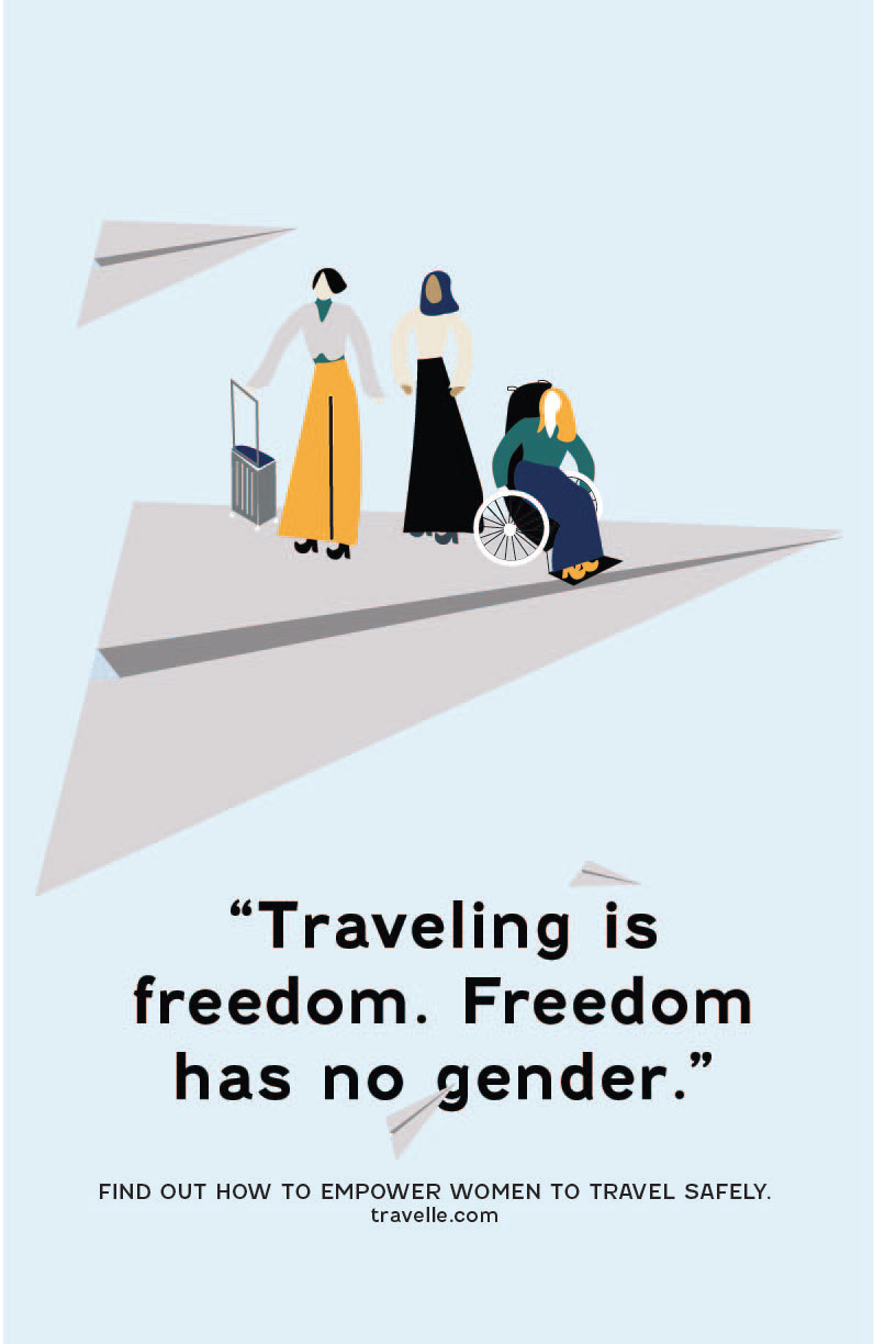
Above: The final ideation of my poster. I changed the background color from white to blue to create more contrast, changed the text from a serif to a sans serif (to make it less feminine), and changed the colors of the characters' clothes to be more neutral- I also changed the look of the wheelchair to be more realistic in style.
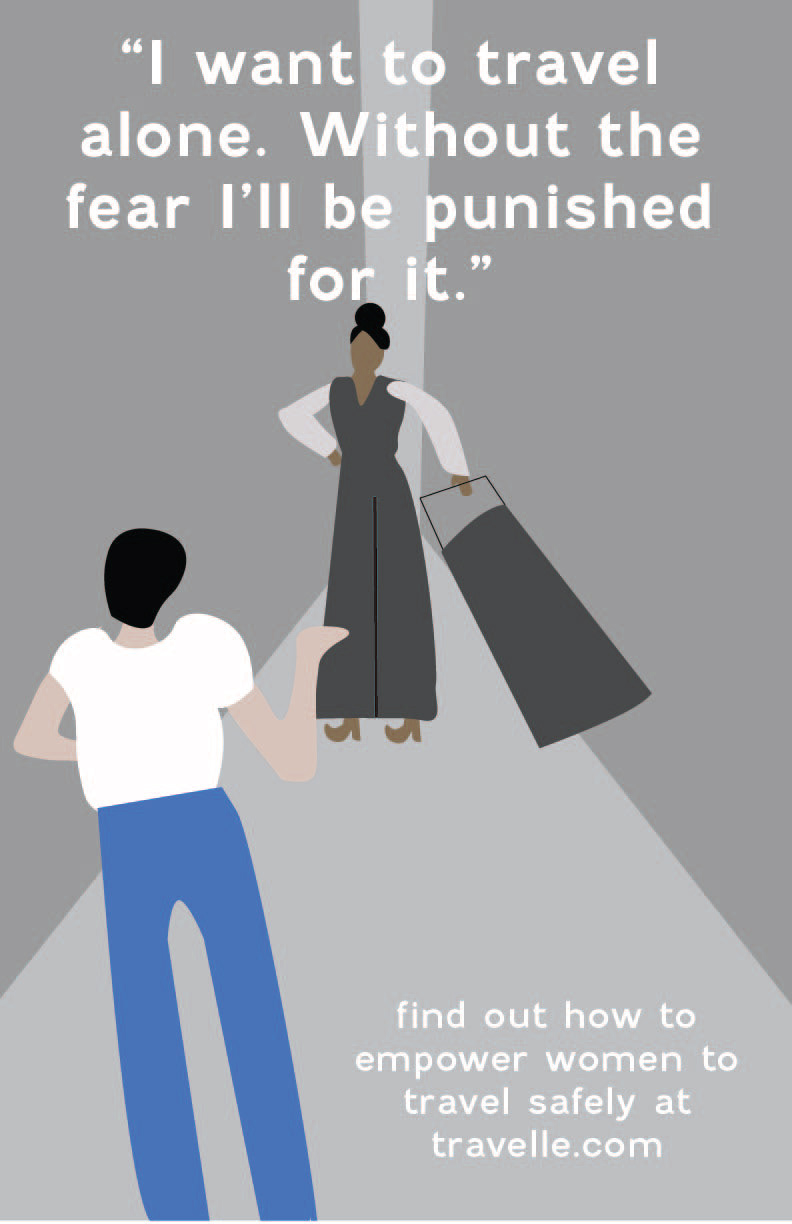
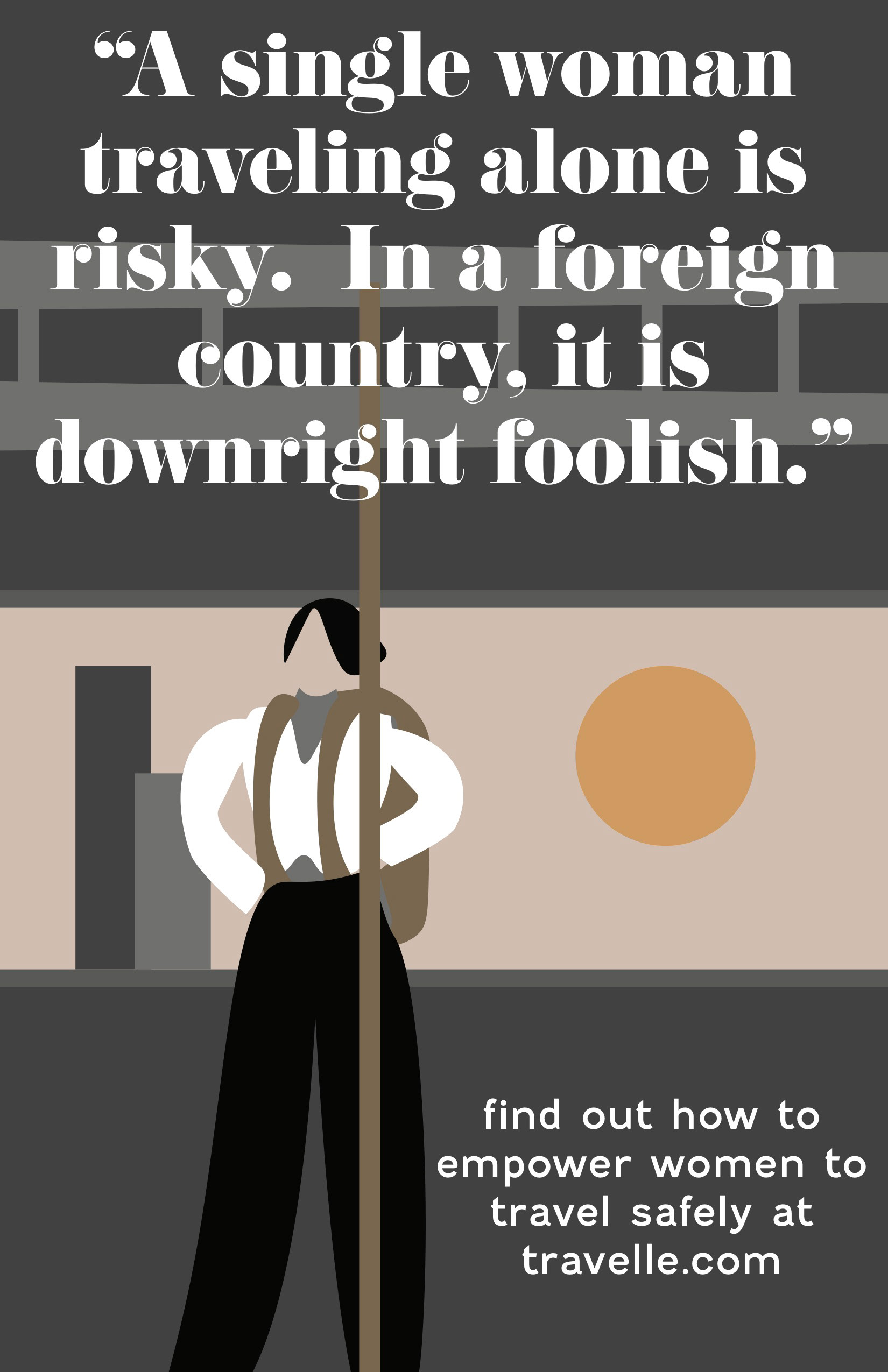
Above: The other two posters I created.
This project was definitely my favorite of all three this quarter. I love the style of illustration I chose, I think the symbolism and style of the poster is really well-executed. I used the grid well, my branding was cohesive, and I worked hard to apply the critiques I received to my poster. This piece will definitely be going in my portfolio!