
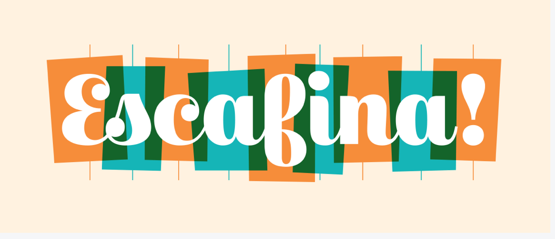
Above: Escafina. This is an upright script font, drawing from decades of inspirational lettering. The creator was inspired by vernacular vintage signage and sign painting. The letters are perfectly vertical, with structured construction with very rationalized forms and a slight brush stroke. Each letter is linked (except the s and c and f and i), and the weight of the spines, bowls, and ascenders of the letters vary dramatically from thick to thin, adding emphasis and contrast. The stylistic ball terminal of the E, s, and c add visual interest.

Above: DDC Hardware. This is an industrial-style typeface, horizontal, simple and utilitarian, inspired by the letterforms on back roads and industrial yards across the USA. This font is characterized by perfectly straight edges (with the exceptions of the curves in A, R, D. and C, with structured construction and completely balanced heights of the letterforms.