
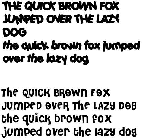
Here, I have used the fonts Cheri and Porky from Dafont.com. Porky, the top font, has oddly angled letters, and some that are closely spaced together (the U and I in quick in the uppercase), and every letter in the word is tightly spaced and connected in the uppercase, which makes legibility difficult. The lowercase is slightly better, but the font is too thick to be legible at a first glance, with odd spacing between the q and the u, for example, or the a and the z. In Cheri, the bottom font, there really isn't much difference between the uppercase and the lowercase, except that the letters such as "O" have a heart in them, and obviously the serifs in the f and t are bolder and wider. Most of the letters seem to be decently spaced, but the gap between the lowercase r and o is odd, or the o and x, and the blatant gap between the o and v in the lowercase line is quite noticeable as well.