
All visual form is made up of visual components, which include lines, planes, and volumes; every component has qualities of size, shape, surface, and shading. These elements, or components and attributes, are coordinated by standards of visual position, bearing, and space. Despite the fact that parts can be independently considered, they affect or are affected by different segments in the shape. We can best assess components by contrasting them. These presentations adopt distinctive strategies in passing on thoughts and ideas, and fill diverse needs. The types of presentations include: literal, abstract, and symbolic. The fittingness of a presentation depends principally regarding the subject to be portrayed in the setting of the message. Philosophical development and social patterns can likewise impact the utilization of one presentation over another.
A line can be a persistent mark, or a progression of short marks, associated by their direction, similarity, and arrangement; and it may be straight or move in various ways. Lines can make shapes and separate space. They are valuable for segregating structures, and gathering data. The surface of an object is frequently called the plane. Volume is the result of lines and planes. It alludes to the figment of a three-dimensional frame on a two dimensional surface, and to the implied volume inside a shape. Regardless of whether strict, conceptual, or emblematic, geometric or natural, 2-dimensional objects share the fundamental visual attributes of size, shape, and surface. Even the most dynamic creations have a tendency to have uninvolved territories that give a visual rest and that stand out from the dynamic regions.
Negative space alludes to an apparently vacant, however dynamic, region of an object. Images and depictions can be cropped, like photographs, to include less or more negative space, or show more or less of a form. This negative space can seem to consume the encompassing components. Figure and ground are utilized to portray an impression of spatial communication, creating design interactions, and allude to a component positioned in front of the background, which is the bigger region encompassing it. Researchers have considered the figure-ground relationship and have discovered that our eyes comprehend form only if it is juxtaposed and discernable from the foreground. This is achieved through a distinction between the foreground and background. Profundity and three dimensional outline is physically present. In addition, in two dimensional design, a figment of profundity is made through pictorial pieces of information. Our visual cues that discern contrasting or direct understanding, and incorporate changes to scale and point of view from two dimensional surface, are made using lines
Works Cited:
Bowers, John. Introduction to Two-Dimensional Design Understanding Form and Function. John Wiley & Sons, 2008.
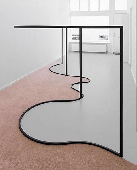
Above: Image source: https://www.instagram.com/p/BJwFDjXBy0Z/. The use of mirrors, contrasted with a high-texture piled carpet (and the use of a thick black line running between them, and mirroring the work) questions the viewer's eye- the ceiling is mirrored in the floor, which appears that the ceiling is indeed melting onto the floor... The line provides divisive (nearly cartoonish) separation between the two elements.
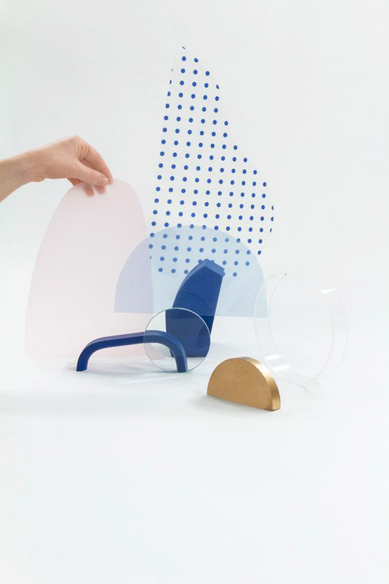
Above: Image source: https://trendland.com/graphic-experimentation-for-minimalist-images/. "Maxime Francout is a French artist and designer. His series “Experimentation” explores different design combinations and patterns in order to create strong minimalist images. Francout’s expertise in patterns, typography and abstract drawings has led to multiple awards in addition to features in magazines from all over the world." The use of many textures and elements (including transparency) creates interesting visual abstraction between implied and occupied space.
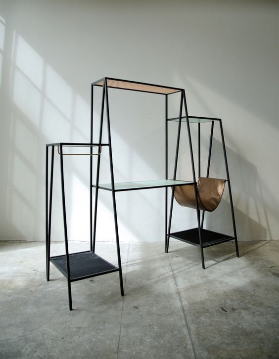
Above: Image source: https://retaildesignblog.net/2016/01/10/alpina-furniture-collection-series-01-by-ries/. "Alpina is a furniture collection that seeks to relate, with its slender lines and angular geometry, to the spaces it occupies not as volumes but rather as a set of vectors and planes in the air." The use of negative space here is quite artful and very visually pleasing (while still very functional). "Research looks into the capacity of a matrix to mutate in order to conceive formal pieces. By operating on this matrix with the sole premise of preserving its proportions, spatial relationships are established that define the identity of the formal pieces."
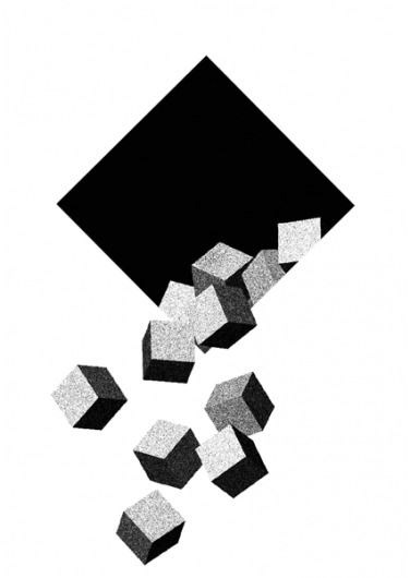
Above: Image source: https://www.designspiration.net/save/11343309632/. this piece shows the interesting dynamic and contrast between 2-D and 3-D design- the small grey blocks appear to fall from the seemingly flat black square- our minds struggle to make sense of the dynamics of such a concept.