
Visual language alludes to the design of visual components and their qualities. Visual arrangement is like composing music, in which rhythm, sequencing, and pattern are considered. A shape that offsets change with the level of consistency among its parts is visually pleasing. Structure can likewise be utilized to make contrast and hierarchy evident, within architectural structures, for example in vernacular design. In the broadest sense, visual dialect is an arrangement of components orchestrated by the standards of a specific action, element, or development. It is an impression of taste and style connected by methodologies and plans, in which the deciding variable is appearance and utilization.
These visual dialects may best depict their opposite characteristics, for example, official and unofficial, corporate and casual. In addition, in contemporary design, a wide scope of dialects are utilized while filling various needs. As in the construction of physical structures, visual structures assist to hold together the components of an arrangement. Structure is for the most part important to make meaning and a feeling of congruity. Structure enables different components to be comprehended as a whole. These structures may be organized using grids- for example, city planners or UX/UI designers use grids to create an organized structure that is logically laid out, while simultaneously remaining pleasing to the eye. The lines of a grid can align vertically, on a level plane, or askew. Convergences of the lines result in quadrants in which segments can be set. A structure might be apparent through the situation of the components, or as a visual component itself. This portrays the visual structures we see every day. They additionally speak to the non-visual, for example, the measure of time we work in a given day. Proportion is also utilized to provide harmony in visual arrangement- we can see natural proportion at work in nature, for example, through the use of the Fibonacci sequence (seen in shells, leaves, etc.)
Repetition is the use of identical elements, repeated through a sequence. Frequency is the amount of times an element is used. Rhythm is the visual sense of movement- guiding the eye through a sequence. Form is the basic structure of an element. Size and color are used to provide variance and visual interest. Direction is used to imply movement through space, and is a linear concept. Texture is also used to provide visual interest, and is implied tactile texture (though it may be literal). Mirroring is the use of elements as if in a mirror, for example an element may be used, and directly reversed, to give the appearance of duality. Rotation is the turning of an element, around an axis- which may be its own or the axis of another object. Like the planets, elements may be rotated to imply movement or juxtapose one another. Upscaling and downscaling are used to imply size and relevance, as well as relative placement. Path is quite obviously the implied line of movement of elements.
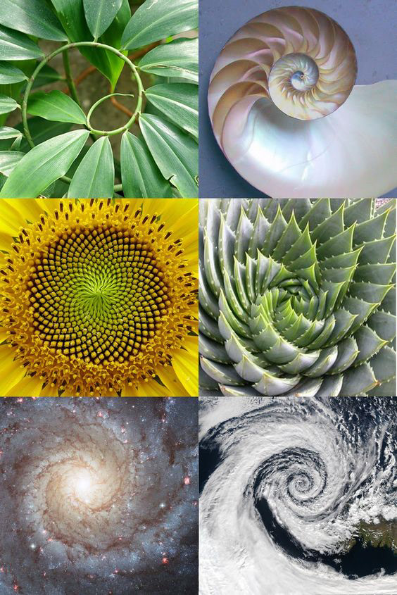
Above: Image Source: https://medium.com/@TheConstructionZone/what-s-so-sacred-about-geometry-anyway-a440d5292bc9. This series of 4 images shows the natural occurrence of the Fibonacci sequence: a vine, a shell, a sunflower, a succulent, a nebula, and a cloud formation viewed from space. These all echo the visually pleasing spiral, and mathematical proportions, that are valued by the Fibonacci formula.
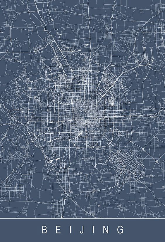
Above: Image Source: https://www.etsy.com/ca/listing/236868417/beijing-city-map-line-art-city-map-road?ref=shop_home_active_93. This illustration shows the orderly, gridded city grid of Beijing. Not every city is mapped like this- obviously, I have not been to Beijing, but Seattle's grid is much different, as it was founded by three different families. Its grid shifts and changes three different times, which is very inefficient for city planners and development, even now nearly 300 years after its foundation.
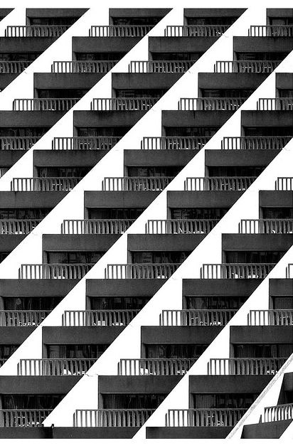
Above: Image Source: http://www.flickr.com/photos/74993631@N00/sets/72157602820270834/. This image uses superimposed photography and repetition to create rhythm and a pattern. From far away, the white space of the wall contrasted again at the dark angular shapes creates a triangular, modular pattern.
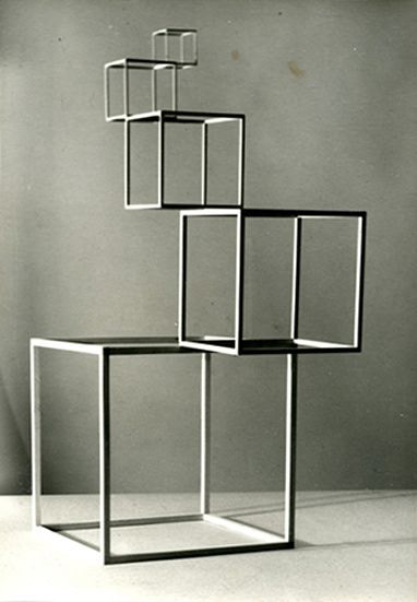
Above: Image Source: http://midcenturymiskatonic.tumblr.com/post/16533993840/anatomy-of-form-by-anne-tyng-she-was-a-pioneering.
Anatomy of Form by Anne Tyng
"She was a pioneering female architect whose ideas about geometry influenced Louis Kahn’s modernist buildings. Although she was among the first group of women to graduate from Harvard University’s architecture school in 1944, she struggled her entire career to be taken seriously. Firms would not hire her because she was a woman." I really like this form because the smaller cubes seem to be almost floating on top of the larger ones. This is quite a feat of structure- the cubes must have been carefully designed as to rest elevated, even with such a small area of ground to connect and balance.
Works Cited:
Leborg, Christian. Visual Grammar. Princeton Architectural Press, 2006.
Bowers, John. Introduction to Two-Dimensional Design Understanding Form and Function. John Wiley & Sons, 2008.