
By definition, typography, apart from being aesthetically pleasing, should carry a message. This message, and its communication, is at the core of typographic activity, at the stage of each unique phrase and entire passages of text. This is called linguistic meaning, since it resides in language. Familiarity with both the simple shape of letterforms and the anatomy of type is necessary to see how typefaces fluctuate and what characteristics they share, and permits the designer to make choices about how to select and use the multitude of typefaces available, or create their own. The most simple element of typography is the letterform, and each typeface has its own unique characteristics, while sharing a basic language that describes its parts. Selecting and comprehending the use of typefaces is complicated, but is easier to understand with practice. Understanding how to utilize space in typography is also essential. Proper spacing impacts legibility, and space is additionally an integral and powerful piece of any composition. Traditionalists argue that serifs contribute to legibility by differentiating between letterforms, elements that maintain the eye's tracking along the line of type. However, modernists argue that sans serifs don't actually make the text harder to read; readers are actually becoming more accustomed to sans-serifs through seeing them on their electronic devices. Knowing how to solve problems of emphasis in typography is a fundamental skill. This involves thinking about the relationship between elements such as the measurement and weight of type, choosing to emphasize some content, while minimizing other aspects of the design. These kinds of typographic decisions relate to what are called hierarchies of information, given that in any design, some things should be seen before others.
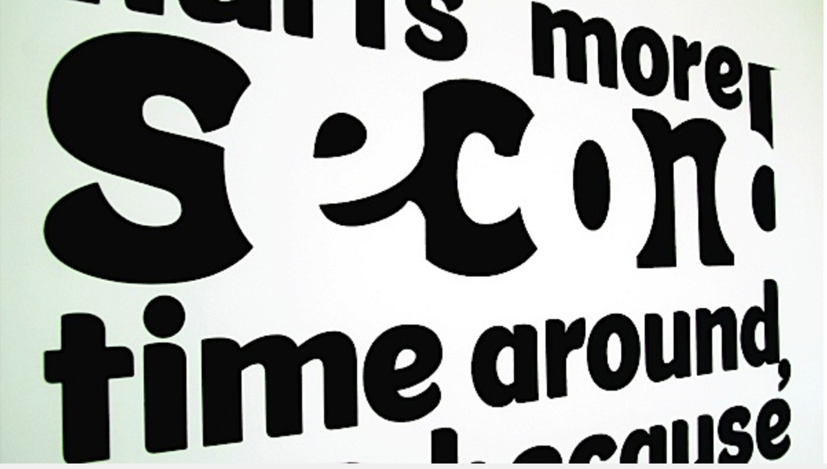
Hierarchy — it’s a big word, but an easy-to-implement concept when it comes to typography. These days, our headlines or titles don’t have to be six inches tall to catch readers’ attention, but the image above provides a dramatic reminder of just what typographic hierarchy is all about — organizing and formatting your type choices in such a way that readers or users can clearly see what’s most important, which enables them to easily navigate the layout at a glance and quickly scan to find the information they’re looking for. Enhancing readability and usability are some of the most important benefits of establishing a clear typographic hierarchy. Size is the simplest way to create contrast between different typographic elements in your design, especially if you’re only working with one typeface. Remember — hierarchy is all about helping your most important information stand out visually. Whether that information is a name , the title of an article or blog, or a special discount or promotion on an advertisement, if you set that type at a size that’s larger than all the other text in the layout, it’s sure to attract attention. Keep in mind that you don’t want to choose too many typefaces, which will only clutter and crowd your design; two to three will suffice for most layouts. Many fonts come with a variety of style and weight options. Different styles might include italics, small caps, or condensed or extended versions. Weight refers to the visual lightness or heaviness of a typeface.
When you’re looking at a layout that is spaced well, it’s immediately obvious how you should go about reading or getting information from the design. But when you’re looking at a design where maybe the designer felt that he didn’t have enough space to work with — then you might find yourself squinting at text that’s too small to read.
When you’re looking at a layout that is spaced well, it’s immediately obvious how you should go about reading or getting information from the design. But when you’re looking at a design where maybe the designer felt that he didn’t have enough space to work with — then you might find yourself squinting at text that’s too small to read.
Hierarchy seems intimidating, however it is a simple to-execute idea in typography. These days, extremely large fonts aren't necessary to get the desired effect of emphasis, yet sorting out and organizing your content so clients or readers can quickly draw out what is most important, which empowers them to effectively explore the format and rapidly discover the information they're looking for. Enhancing comprehensibility is probably the most critical advantages of building up a reasonable typographic hierarchy. Size is the most simple way to create contrast between various typographic components in your plan, particularly if there is only one typeface in the design. Remember — order is tied in with helping your most vital information be seen in priority. Regardless of whether that information is a name, a title, or an exceptional markdown or advancement on a promotion; it makes logical sense for that information to be the largest in hierarchy within the design. Designers should avoid combining an excessive number of typefaces, which will just complicate your outline; a few will get the job done for most layouts. Many text styles accompany an assortment of style and weight alternatives. Diverse styles may incorporate italics, or dense or expanded variants. Weight alludes to the visual softness or impact of a typeface. When a well-organized layout is examined, the order of importance in which the information should be read is clear.
Above: The use of negative space in a typographic design adds interest to what would have been a fairly monotonous design (with only size as contrast). The designer has used negative and positive space to make the viewer "imagine" the missing letters. Source: https://adashu89.wordpress.com/2013/10/08/negative-and-positive-space-in-arts/
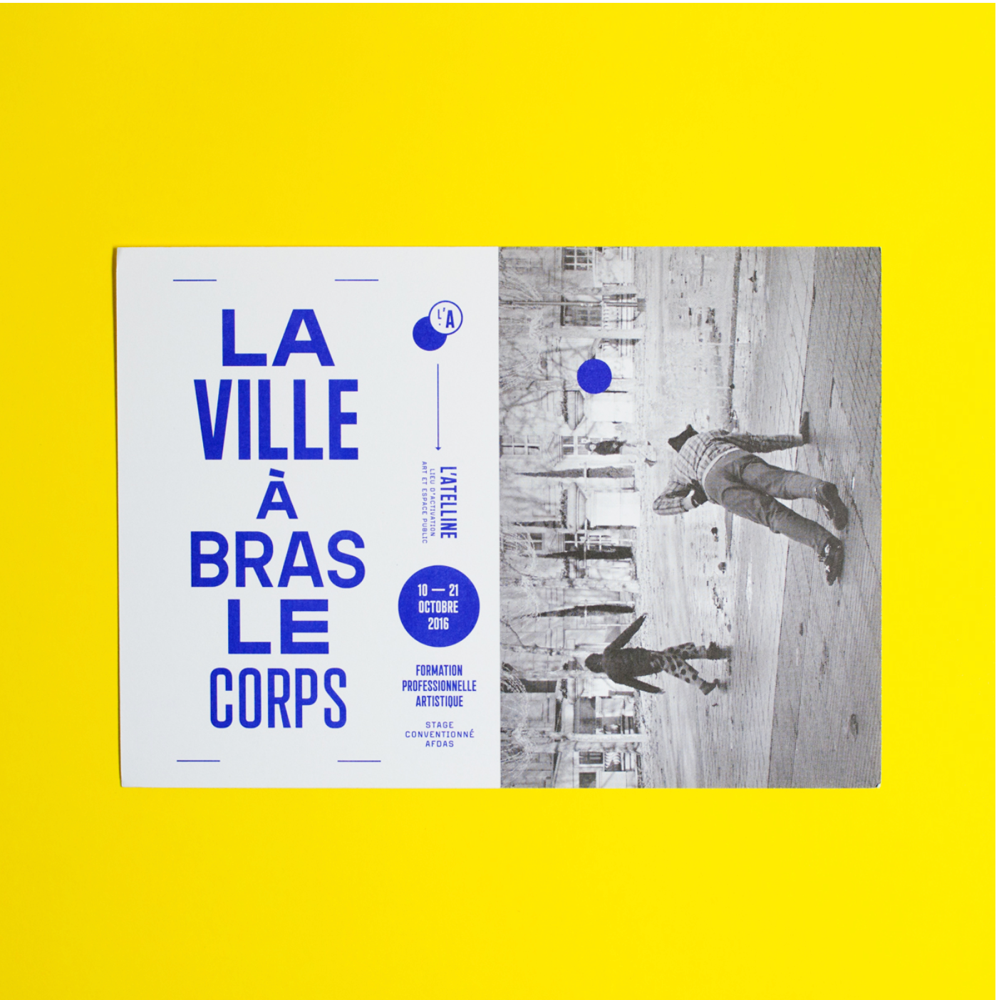
Above: Here, the designer has used what appears to be the same typeface consistently throughout the design, but has created interest by varying the size, height, weight, and width of the fonts. On the left, each line has a unique pairing of these factors. Source: https://fontsinuse.com/uses/20488/l-atelline?utm_source=feedburner&utm_medium=feed&utm_campaign=Feed:+FontsInUseAll+(Fonts+In+Use)
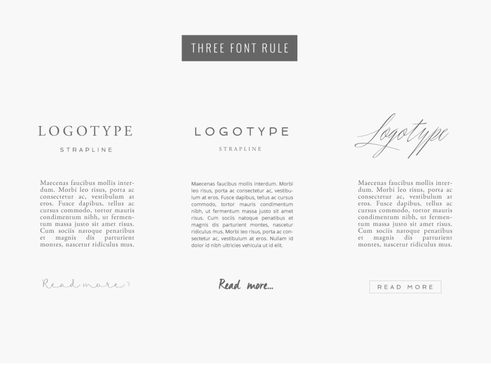
Here, the designer has illustrated how to use three fonts to establish hierarchy and interest, without making the design seem cramped or unorganized. She gives three examples of title fonts, three examples of body text, and three examples of what, in print design, would be the pull quote. Source: https://thedesignspace.co/choosing-fonts-for-your-design-project/
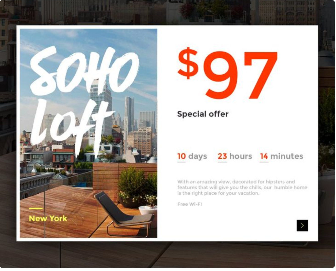
This is a good example of classic hierarchy in advertising. The price and name are the largest components, followed by the words "Special Offer" (so that the reader knows this is exceptional), the location, and a countdown-style date. The smallest text is a description of the building. Source: https://www.canva.com/learn/typeface-fonts/
Works Cited
Dabner, David, et al. Graphic Design School: the Principles and Practice of Graphic Design. John Wiley, 2017.
Kliever, Janie. “Why Every Design Needs Three Levels Of Typographic Hierarchy – Learn.” Canva, 25 July 2015, www.canva.com/learn/typeface-fonts/.