
To pick or allot color for a particular reason, designers should first understand how color functions, how hues are classified, and the terms used to depict them. Learning about the setting in which the completed work will be seen is crucial to the utilization of color in visual communication. Color dramatically affects the way a design reads, and should be chosen intentionally. Complexity and congruity are manners by which the use of color can be improved within a design. Color can be used as contrast or harmony, depending on the desired effect. Why are different colors favored, or appear to be more successful? Through history, colors have come to hold specific affiliations with nature, and have, after some time, become established in research in psychology and the way science understands visual content and the brain. Colors have come to have social, emblematic, and individual affiliations. To utilize color well, one needs to understand how it functions as a dialect. It is an effective device, particularly in UX, when it is utilized to enable the designer to arrange information in different structures, and to help the experience of exploring the website or design. Since color has been demonstrated to be seen before shape or form, it is great at keeping instructive hierarchies and guiding the eye through designs.
Color is a lovely thing that brings about distinctive feelings in people. We see things and separate concepts utilizing color. Different hues bring about different emotional and psychological reactions when seen, delivered in the visual arrangement of the human cerebrum. All things considered, the colors don't exist. We fabricate colors in the mind, which implies hues remain subjective in nature and are not inherently objective. Colors are used in marketing to obtain desired reactions, such as the iconic red and yellow schema of McDonalds, or the green and white of Starbucks, that are engineered to produce certain reactions in the minds of consumers. This logic isn't just about being practical or marketable. The human mind seems to remember certain brands and associate them with the colors of their branding. To create designs for a brand that will be well-associated and unique with the brand’s identity, you need to utilize the hues that align with the business’s thoughts, identity, feeling and contrasts strongly from rival brands. Every color has its own cultural and social associations. One of the most well-known is black, which stands out amongst the other colors, speaking to power and timelessness. Black is traditionally thought to be the most grounded shade of the range. Black has been incorporated in designs from the earliest manuscripts to the modern era, because of its associations of wealth, impact,and intensity.
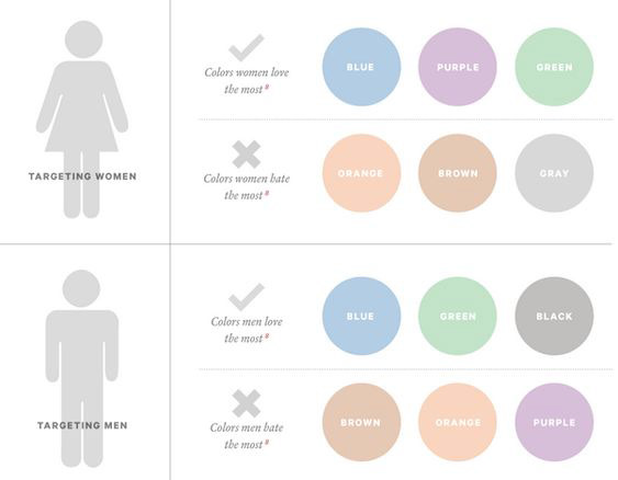
Above: An infographic about the differences in gender in relation to color. As it shows, both women and men favor blue and green, and hate orange and brown. However, men and women were the opposites when it comes to grayscale colors (black and gray). It is interesting that this infographic doesn't include red or pink, the stereotypical "feminine" color. Image source: https://www.pinterest.com/pin/202450945732961431/

Above: an interesting piece that shows the color relation between CMYK colors. Using circular forms, the artist has shown the different combinations possible when overlapping or combining the four tones. Image source: http://www.amenidadesdodesign.com.br/search?updated-max=2015-01-15T11:48:00-02:00&max-results=7
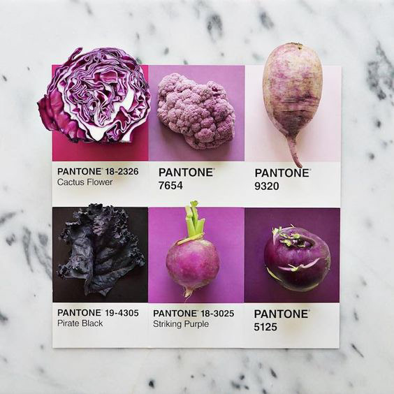
Above: a cleverly designed flat lay that illustrates Pantone's color of the year for 2018, in varying shades of vegetables. This illustrates that the colors we choose daily to fill our designs have their roots in nature, and the environment around us. Image source: http://piwee.net/1-pantone-aliments-preferes-211217/

Above: This infographic shows the associated keywords, emotions, and reactions that each color tends to create, ranging from negative to positive connotations. Some colors have both negative and positive associations, inferring that the placement and context is necessary to invoke one or the other. Image source: https://coschedule.com/blog/color-psychology-marketing/?utm_medium=email&utm_campaign=CMU%2520APRIL%252019TH&utm_content=CMU%2520APRIL%252019TH+Version+A+CID_6cd780360db30ace148c783ccae8c8ae&utm_source=todaymail&utm_term=The%2520Know%2520It%2520All%2520Guide%2520To%2520Color%2520Psychology%2520In%2520Marketing%2520Plus%2520Free%2520Hex%2520Color%2520Chart#_a5y_p=5291883
Works Cited
Batagoda, Muditha. “Color, Psychology and Design – UX Planet.” UX Planet, UX Planet, 18 Sept. 2017, uxplanet.org/how-color-can-effect-emotion-ccab0431b1d.
Dabner, David, et al. Graphic Design School: the Principles and Practice of Graphic Design. John Wiley, 2017.