For this blog, I will be analyzing the design for a conference that has already passed, located in Copenhagen Denmark, called "Design Matters."
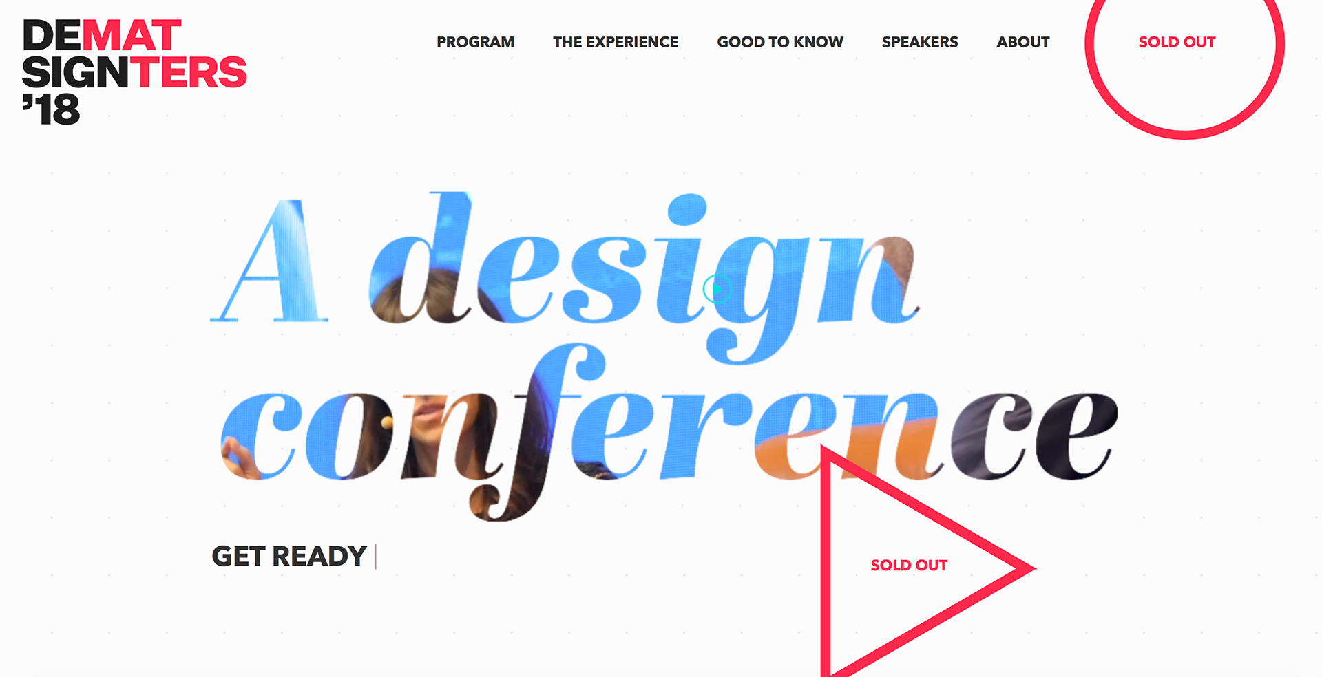
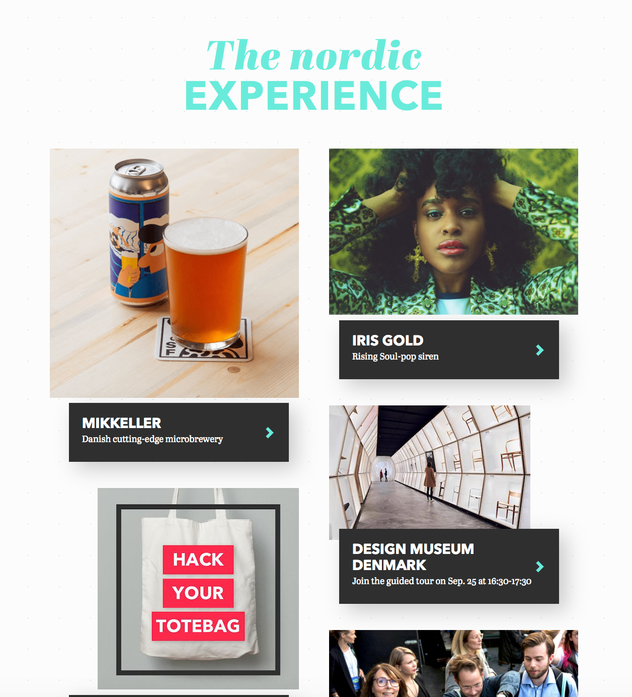
The design is graphic and bold, with two primary fonts, oversized to emphasize the features of each, the first geometric in all caps, the second an italic script, with fine-lined finials. The colour scheme for the conference relies on a sophisticated scheme: a vibrant turquoise, a bright cerulean, a warm cherry red, an earthy ochre. These colours are of course set against a bright white background, with a dark charcoal and light smokey grey used for contrast.
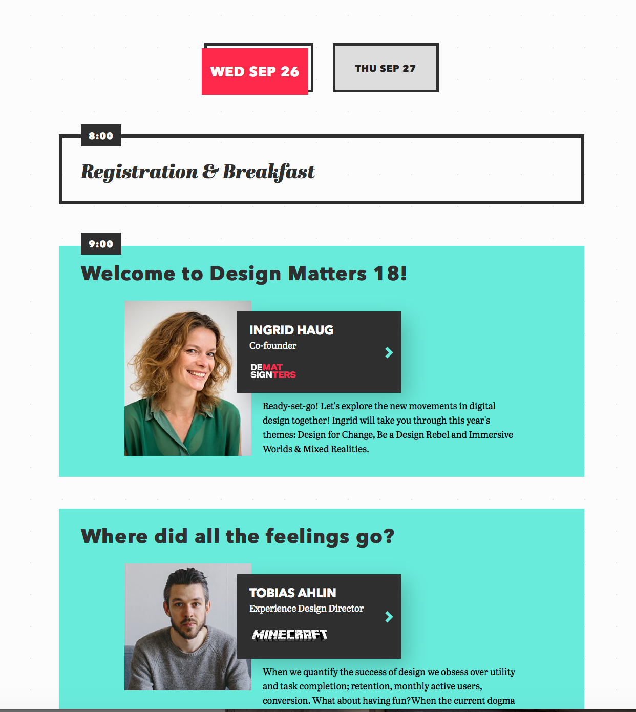
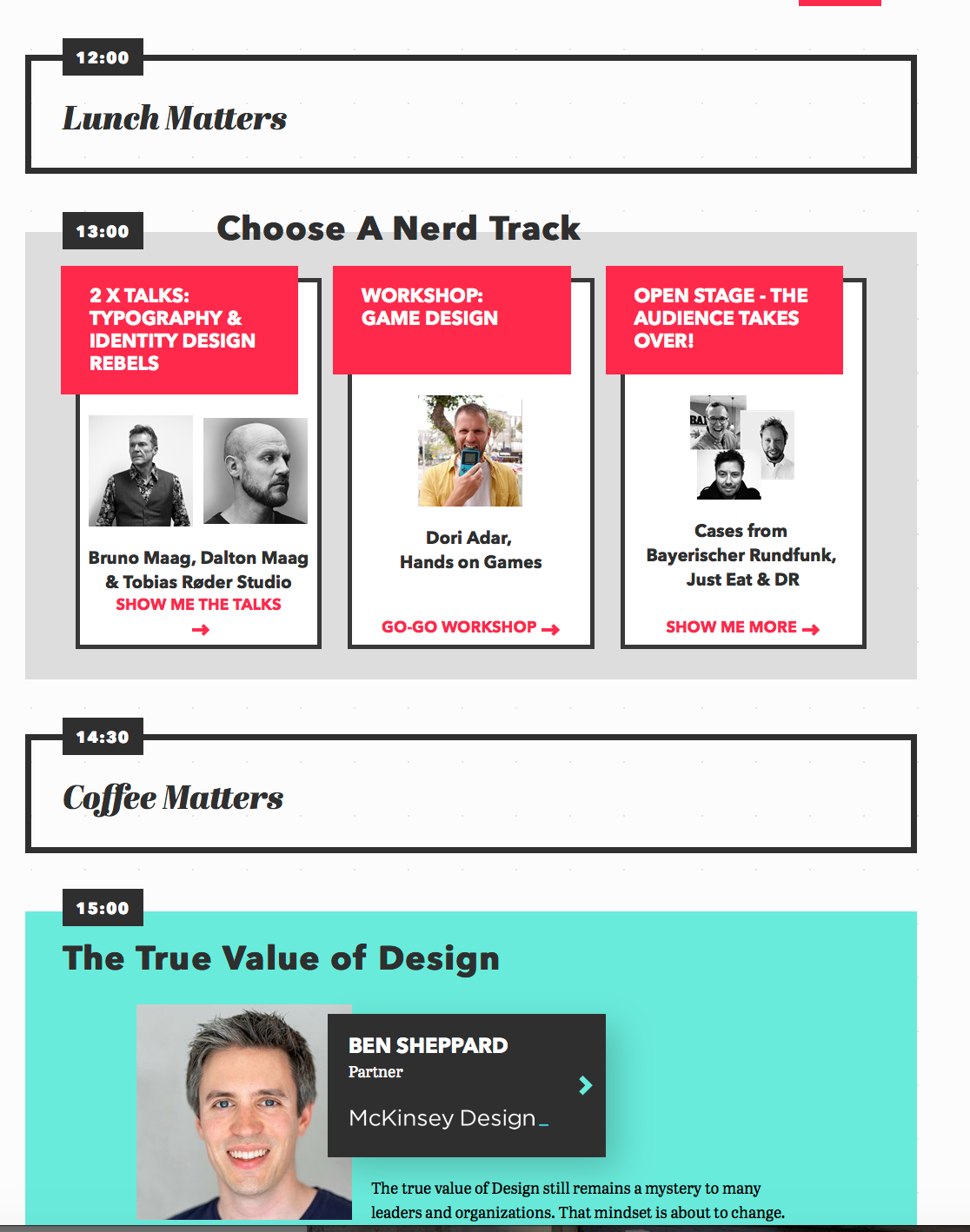
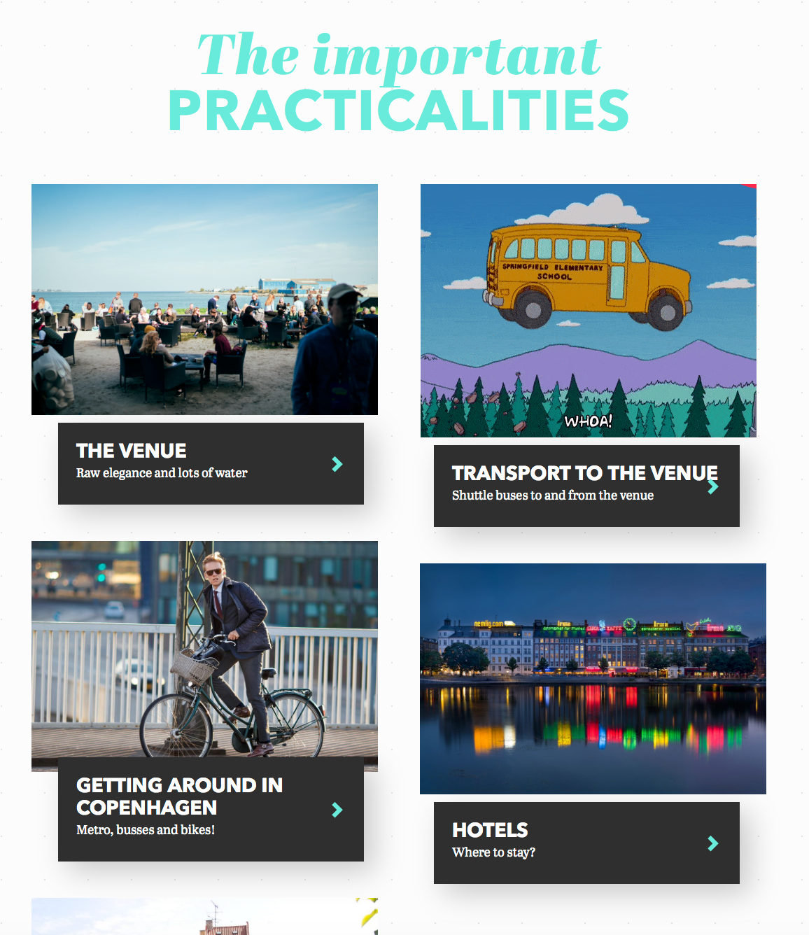
The design concept itself is fairly minimalist, using simplistic geometric shapes to break up the content, variating the colour and value of these boxes, circles, and triangles. There is an element of interaction to some of these shapes, that shift in size and orientation when the user scrolls over or by them. Under the “Program” page, each kind of event or content seen on the schedule has a coordinating format- mealtimes and breaks are in a white box with a charcoal outline, speakers and programming are featured on bright turquoise boxes, and the “choose your own adventure” workshops are red on white/black/on grey. The times for all the events are uniformly placed in white on charcoal boxes. The use of this colour coding preserves a sense of organization and variation, while the brighter colours draw the reader towards the most important information- a sense of hierarchy and importance are noted. At the footer of the page, the sponsors’ labels are all presented in the same unified black.
After nosing around a bit on the site, I believe the designer of the promotional materials/website for the event is Mia Stigsnaes, a graduate in Digital Design and Communication from the IT University of Copenhagen, and is the cofounder of No White Walls, a design agency.
Source: designmatters.io