
SUMMARIZE:
To keep the design choices in line with the project goals, it's important to consider all aspects of your artistic choices and think with your end goal in mind. A popular formula for infographics or motion graphics is to introduce a problem, explain why this problem is significant, and show the reader a solution to the problem. Visual communication is all about conveying meaning quickly alongside words. Just as how a clean desk can help a clear mind, the same applies - eliminating clutter will let the visuals take prominence. If the content is structured in such a way that divides material into sections, consider using color or visual cues to create transitions or links between points, which will create a subliminal narrative.
Visual cues such as arrows cancreate a clear transition between sections. Using shades of color or different textures can build consistency or emphasis within a design. To think like an infographic designer, you have to keep your eye focused on what's at stake: clear communication. Every visual moment should have a point that contributes to the overall interpretation of the piece. The infographic should have a higher impact with an effective design put into place, increasing the reach into your target audience - and you may even expand your audience in ways you didn't expect.
The process for conceiving, designing, and producing an infographic can seem overwhelming. When each step brings you closer to reaching your intended audience and tocapturing your company's brand, the infographic design process should be anexciting, effortless endeavor. To make an effective infographic, it needs to be on par with your overall objective. Once purpose and means are outlined, writing your infographic's text is the next step. Text helps to clarify your infographic for your audience, detail the information, and capture nuance. When developing content, make sure that it advances the purpose of the infographic at every step. Keep data involved when possible, and make sure that there will be a way to articulate a clear, connected visual once the text is final. By the end of the wireframe, a cohesive infographic that matches project goals should be in sight.
Give your infographic a close inspection to make sure that all elements suit your company and project needs. If there were any tweaks after seeing the infographic, get those all shaped up. Once your infographic is launched and live, take a minute to debrief on the process that just happened. Infographics are a keystone of visual communication strategy and contribute significantly to content marketing and company profiles. An infographic can exist as a standalone piece, or as part of visual communication campaign, so keep in mind how this piece could connect to diverse projects or broader company goals.
Above: Image Source: http://www.idnworld.com/creators/TanyaTest.
Above: Image Source: https://i.pinimg.com/originals/d6/78/b0/d678b03a45fbfa299862caf9d49e53ce.jpg.
COMMENT:
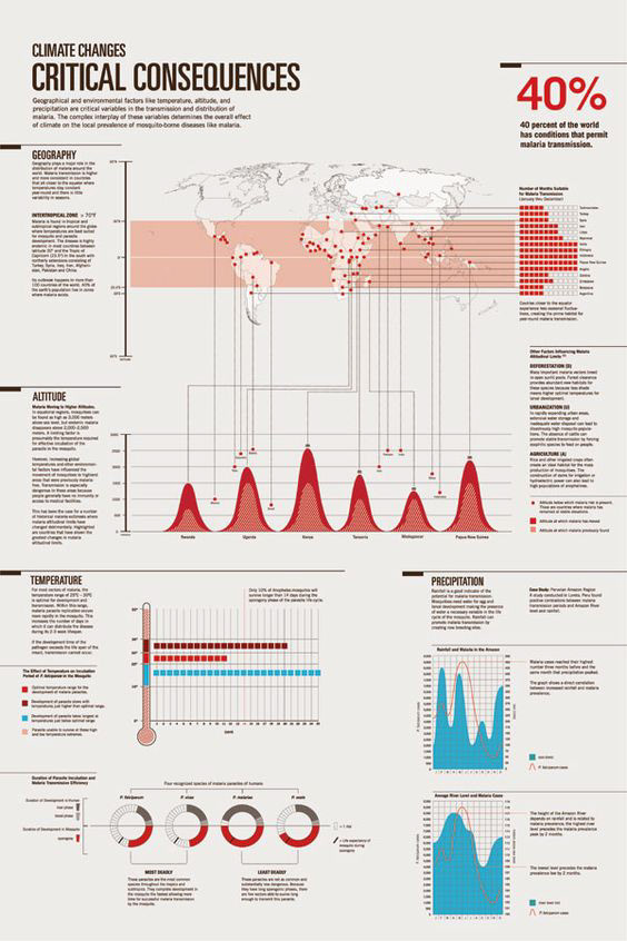
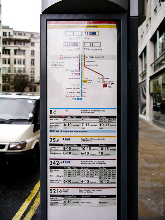
These two examples of information design graphics are two different ways of displaying complex groups information in a way that individuals can quickly glance at, and digest. In addition, infographics, much like maps, require the ability for the reader to quickly locate a specific piece of information- such as the temperature of a certain year or what time the next bus comes.
The “Climate Changes” infographic shows five different types of infographics: a map, three kinds of bar graphs (one being represented in dots, the other two mountainous swoops of various colors), and a sort of modernist pie chart. The use of red and blue against the cool taupe background keeps the infographic feeling clean. Systematically, the infographic breaks down information into the various categories, making it very easy for the most uninformed reader to quickly find a specific piece of data.
The London bus time table achieves something all Seattle bus time tables do not: it clearly shows the route and connecting routes, much like a subway map (in the abstract sense, as relative distance and routes do not matter). The more frequent bus routes are simply listed under the frequency of their arrivals (something Seattle bus time tables also lack), and exact times are listed in a clear, concise Swiss way, such as “0013,” even eliminating the need for “:”. Finally, the CMYK colour scheme allows for clear coordination and separation of routes.
Works Cited
Denning, Ian. “4 Content Keys to Compelling Data Visualization.” Killer Infographics, 25 Feb. 2016, killerinfographics.com/4-content-keys-to-compelling-data-visualization.html Links to an external site.
Pollokoff, Abi. “How to Think Like an Infographic Designer.” Killer Infographics, 8 Dec. 2016, killerinfographics.com/how-to-think-like-an-infographic-designer.html;Links to an external site.
Pollokoff, Abi. “Infographic Design from Start to Finish.” Killer Infographics, 10 Aug. 2016, killerinfographics.com/infographic-design-start-finish.html;Links to an external site.