
A fruitful infographic boils down to just a few important things: an incredible concept, nitty gritty research, astounding generation and wise effort. This includes securing cutting-edge information from respectable sources. Essential, research can be an awesome method for anchoring press inclusion. To conduct research, start inside your business or converse with your customers. There is regularly an abundance of data secured away, such as reports. Research assembled through auxiliary methods is generally more work, yet it is much of the time less expensive. It is important to continuously search for the latest information. Burrow for information that is difficult to get, surface the parts of a story that it is hard for others to discover. Sentiments matter in infographics. "The more feeling the substance summons, the more popular it will become." Remember to reference your sources legitimately. This boils down to individual discretion. Create hierarchy within your infographic: either suggest a conversation starter or feature a standout amongst the most energizing bits of information. At long last, you have the research prepared. Who should you approach for critique first? Customers/administrators, brand groups, and others; who will regularly spot things that you haven't, or distinguish alternate paths to investigate. Finally, bear in mind to always check your own research twofold.
The two infographics below are much different in style, intent, and content. The first is playful yet sophisticated, featuring hand sketched-style elements and organic shapes. The color scheme remains repetitive: a canary yellow, Pepto-Bismol millennial pink, chartreuse, and robin's egg blue. While the illustrations themselves may not be very accurate (in proportion, for example), the outlines and shaky line quality accomplish what the company (in this case, Vinepair) wants the audience to experience: simplicity and authenticity. Each neat, gridded recipe lines up neatly with the sans-serif, bold font. (This is the same one Refinery29 uses if I am correct!) It makes the reader feel as if they are being let in on a secret of some kind- this is the original Portlandia-esque hipster phenomena. Creating a feeling of originality- even when it has been run into the ground by creatives and those that copy them- is a sure way to sell more bottles of alcohol.
In stark contrast, the second infographic is all straight angles and Swiss-style illustration, blocks of color. Its subdued palette of black and slate grey, with dark orange as the accent color, produces a similar feeling of sophistication- but here it is representing the brand Everlane. Honest and open, but without compromising style or quality (or price point..). The icons themselves utilize negative space to provide dimension, and again evoke a Swiss rigidity. The use of this sort of vertical timeline, with circular elements to represent steps along the process, helps draw the reader's eye downwards through the steps. The font is, again, bold, sans serif and matter-of-fact. The grid is followed religiously. Everlane has yet again given its customers transparent information, displayed in an easy-to-swallow format, and capitalizes on its no-frills, yet thoughtful brand guidelines to appeal to readers.
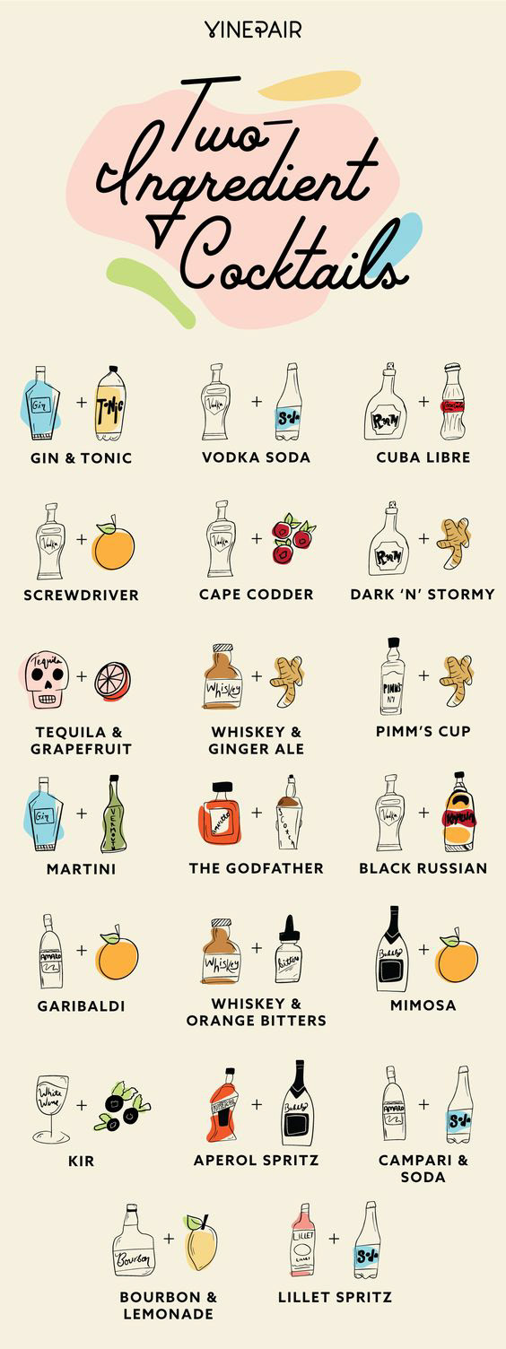
Image Source: https://vinepair.com/articles/20-best-two-ingredient-cocktail-drinks-recipes/
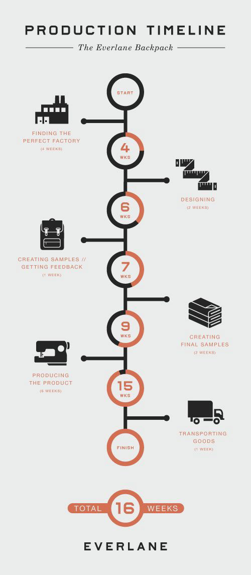
Image Source: https://piktochart.com/blog/layout-5-portraying-history-with-timelines/
Works Cited:
Agate, James. “How To Do Infographic Research Well.” Raven Blog, 17 Dec. 2018, raventools.com/blog/infographic-research/.