
Compassion teaches us to set aside our culture, sentiments, and perspective intentionally so as to comprehend how other people' encounter things profoundly and definitively. It requires a solid feeling of creative ability for us to have the capacity to see through someone else's eyes. It requires modesty, so we can look to surrender our assumptions and inclinations. It necessitates that we have an uplifted familiarity with other people's needs,, inspirations and objectives. Sympathy is a natural quality in all individuals. By sharpening our perception abilities, we can create a more profound comprehension of another person's understanding. A certain level of compassion for the condition of others, prompting the want to act and assist, is required for this, and is one of the essential factors that enable us to defeat our own needs and try to comprehend others. When being compassionate, we construct a feeling of consideration, a profound concern and want to need to encourage, support, and give help.
By being inquisitive, we are normally disposed to dive into unforeseen territories, reveal new experiences, and investigate all parts of individuals' lives. With the What-How-Why technique, you begin with solid perceptions — the What — and from that point move to larger amounts of deliberation — asking How — and after that at last you land at the Why—i.e., the deciding factors behind individuals' practices.
In What, note down the subtleties of what's going on. What's going on with the individual? What's going on out of sight? What is the individual holding? Describe what is happening utilizing descriptive words and attempt to be as concrete as could be expected under the circumstances. In How, depict how the individual is getting along what the person in question is doing. In Why, write what you think their motive is for their actions- try and step inside their shoes for a moment.
The infographics included below are two successful examples of employing user compassion into infographic use. The first utilizes simple, geometric figures and icons, along with playful illustration and font, to summarize each concept in the infographic. The layout uses the grid, alternating visual with text, to lead the eye from top to bottom. The use of the lime green, coral, and sky blue lend a cohesive feel.
The second infographic utilizes different colors to separate visually different elements, the orange is used for the title, while blue is used for data signification, and the magenta and violet are used to represent airlines and airports, respectively. This infographic does a good job (unlike the first) of seamlessly incorporating the company’s logo into the infographic (the blue and orange are well incorporated). Using abstract “bubbles” to visually segregate space and information helps the viewer’s eyes distinguish sections of the infographic. Icons are used for tickets, planes, airports, luggage, and a smartphone; all used to symbolize certain numeric data. Traditional bar graphs are used, as well as a less traditional one (traditionally, a pie chart might be used here)- instead, the icon of the passenger is used repetitively, becoming smaller in progression, in relation to relative proportionate data.
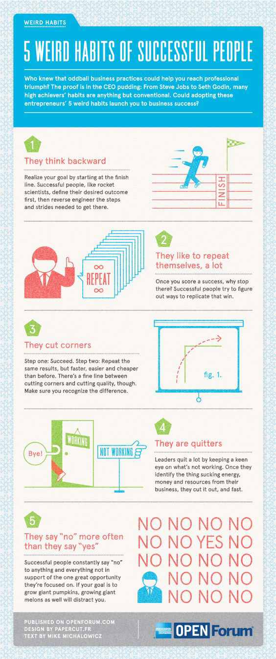
Image source: https://www.lifehack.org/309647/habits-famous-successful-people-5-infographics
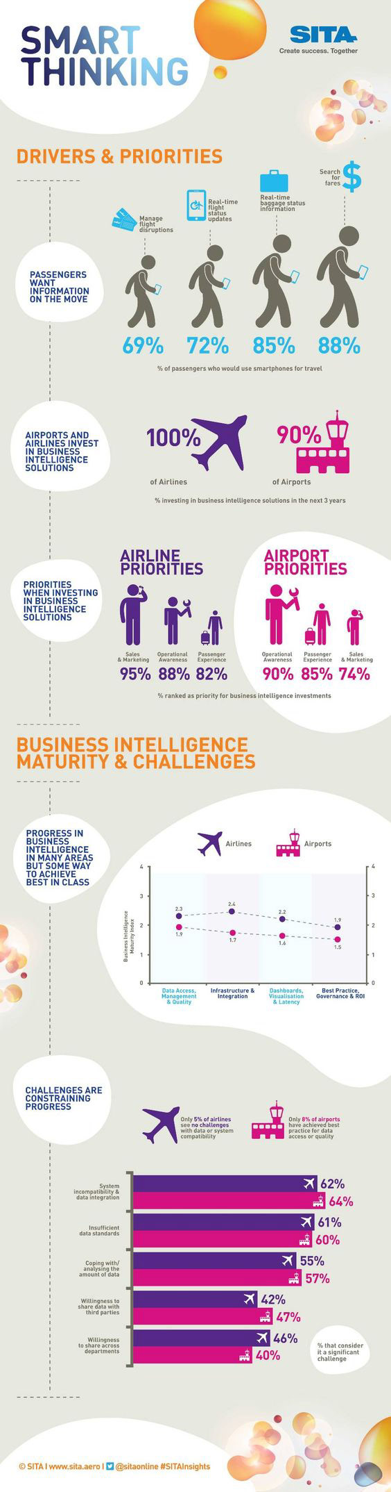
Above: Image source, https://i.pinimg.com/originals/83/92/d2/8392d2cf02ec35eeb3c4a72d2c44c3a0.jpg.
Works Cited:
Dam, Rikke, and Teo Siang. “How to Develop an Empathic Approach in Design Thinking.” The Interaction Design Foundation, www.interaction-design.org/literature/article/how-to-develop-an-empathic-approach-in-design-thinking.