
Reuben Fischer-Baum is an Assignment Editor on the Washington Post designs group, concentrated on governmental issues and sports. Chiqui Esteban is the Post's Graphics Director. This honor winning group produces outwardly determined stories for a consistently extending number of stages, exploring different avenues regarding new narrating methods to enable readers to better understand the news. In news coverage, an assignment editor is a supervisor – either at a paper, or radio or TV channel – who chooses, creates and designs revealing assignments, either news occasions or highlight stories, to be secured by columnists. Reuben recently worked at FiveThirtyEight and Gawker Media. Chiqui recently worked at National Geographic, The Boston Globe, La Voz de Galicia, Diario de Cadiz, Publico and lainformacion.com. Instead of making pure infographics, they design news articles and other forms of media for the Washington Post. Infographics may be included as a component of the articles. Flipping through Fischer-Baum’s creations, I see that normally an article is broken up normally by a few pull quotes, and at least one sort of infographic- be that a map, a graph, or a chart. Their appearance is pretty simple and straightforward, normally using only 2 or 3 colors, but extremely effective.
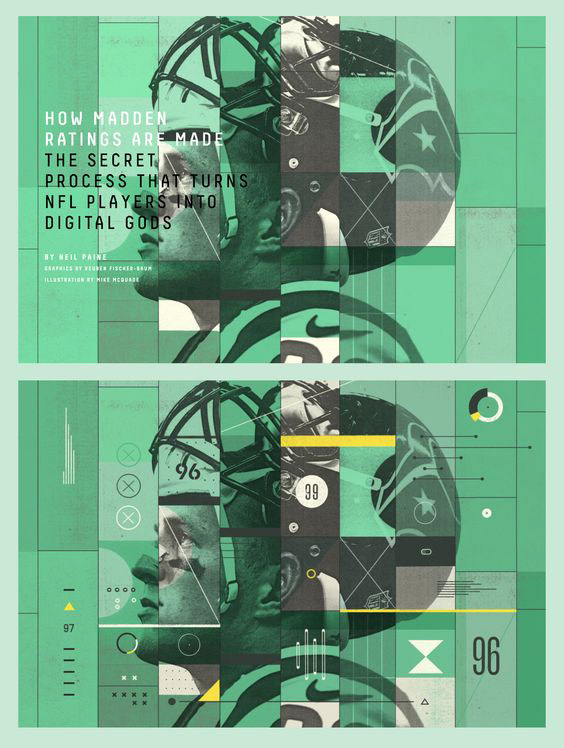
Image source: http://cl.ly/image/272K2i1I0M2F
Above: I love how Swiss this infographic feels, with the photographic overlays and collage-style feel. The use of various symbols (the x, triangle, hourglass shapes circular and vertical graph styles. gridded dots) make it feel very scientific, and the text itself is in a hacker-esque, all-caps. coding-style font, which contributes to the overall style. The (very Swiss) soft off-white eggshell, soft charcoal black, lemon yellow, and chartreuse green complement each other well and allow highlights to be implemented. However, I'm not sure if this is just a mockup (as there is no actual body text within the infographic?) or maybe it would be included in the body copy.
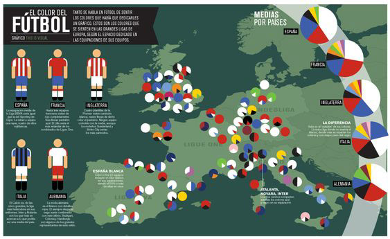
Image source: http://chiquiesteban.com/graphics/colors_of_football.html
Above: I also love this infographic, for its repetitive use of color and simple, easy-to-read style. The repetitive use of the circular pie chart feels very Swiss (along with the repetition of the bright colors)/ The designer's choice to use the muted forest behind the soft chartreuse makes the map feel cohesive, without distracting from the information. Using solely black and white for text and the banner keep the simplicity, and the focus on the information at hand. The use of the stick football player in each various uniform is a fun way to present the information, and draws the viewer's eye instantly.