
A month ago, FAST COMPANY magazine announced the best information illustrations of the year. The decision was drawn from FC's very own postings of the most intriguing information designs. Quick COMPANY, a business magazine that observes trends, at times expounds on structure in relationship to business. On their blog, they talk about structure, design, and computerized media as they influence companies, retail organizations, and tech organizations. They expound on things that individuals who are not architects have likely observed and comprehend to a specific degree. So, why does FAST COMPANY care about infographics? Most people who are not designers may not even know the official term for them- though they see them everywhere. Information illustrations are actually not a recent invention.
Before the dawn of technology, information design consisted of charts, graphs, and maps, which have dependably existed in business productions and papers and were once considered to some degree boring. They were second only to news stories. Despite the fact that a significant number of them were well-made and clever, the publication stories were the main focus and the outlines and graphs and so forth were less important.
Bloomberg's BUSINESSWEEK, as of late, depends solely on infographic designs for their year-end wrap up. A portion of the designs precisely estimated different subjects, while others just seemed as though they did. Quite awhile before, The Sunday NEW YORK TIMES presented the "Op-Chart," which once in a while offers a full page of evaluated factual data, more often than not on things like the total death count of American soldiers in the Iraq or Afghanistan war.
For all significant link news programs, infographics are an absolute necessity. They make any subject look credible and factual. There is even the capacity to create them in the most plebeian of programs, such as Word and PowerPoint. The majority of these outlines, charts, graphs, and maps are intended to seem logical and entirely conceivable. They are quick, even critical, and you have the feeling that you are going to pick up something. They are all piece of an expanding pattern far from perusing, reflection, and understanding the world in a more extensive setting. Though infographics may look appealing, it's important to question the accuracy and validity of the information, and not take it at a face value.
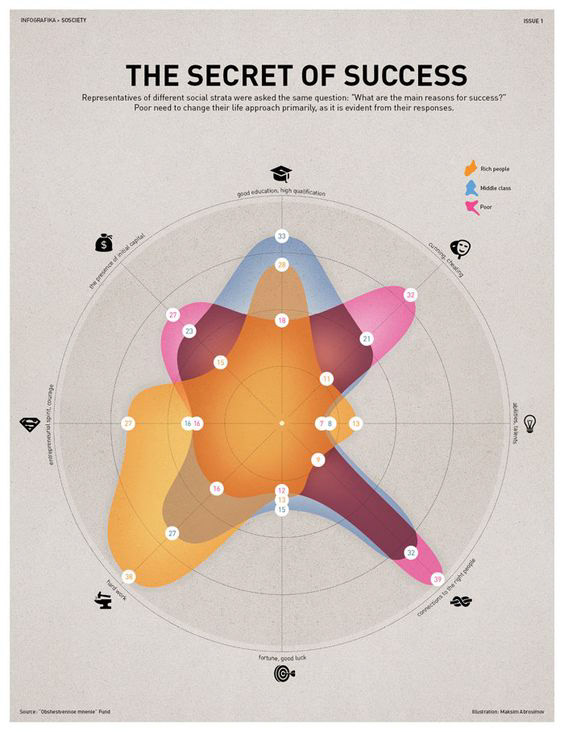
Above: Image Source: https://www.lifehack.org/articles/productivity/this-list-infographics-about-achieving-success-will-surely-inspire-you.html
This infographic is somewhat frustrating, as it is difficult to approach. It also builds its conclusions off social cliches. "Rich" and "poor" people have no universal definition, and true to form, the infographic shows the most "rich" people valuing hard work and the most poor people valuing inherited wealth and corrupt values. The small numbers in white bubbles seem to have zero significance, and the circular dart-board style layout is not clear.
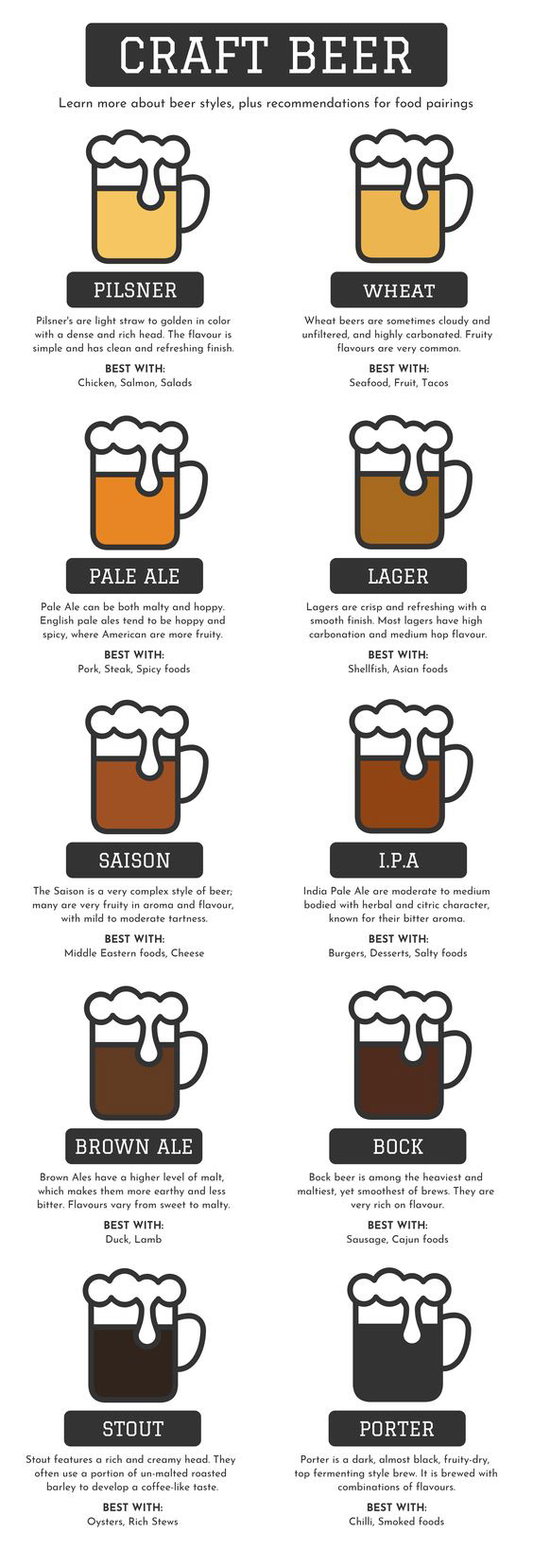
Source: https://venngage.com/gallery/food-infographic-examples-inspiration/
This infographic is the complete opposite of the first! Clear, simple, and clean, this infographic has no misleading information- the layout is traditional but logical, the gradient of light to dark beers is visually pleasing, and the font chosen is quite charming. The illustration is not overwhelming, and it is easy to find the desired information, without straining one's eyes.
Works Cited:
Scher, Paula. “Who Gives The Best Info? A Short History Of Information Design.” The Huffington Post, TheHuffingtonPost.com, 7 Dec. 2017, www.huffingtonpost.com/paula-scher/fauxinfo-its-all-around-y_b_812397.html.