
Information design is the integrator that unites different controls to make incredible data solutions. The term information design is a theme of some disarray and vulnerability. There isn't agreement on precisely what information design is. A prominent normality for information design is simply the expansive scope of fields that connect themselves with it. In the past, it has been said that information design is the executive of different controls. All things considered, that comparison may not be exactly right. Perhaps, information design is the integrator that unites different controls to make great data arrangements.
Information design tends to give the most conceivable clearness, comprehension and viability. As an advisor, an information designer is somebody who assesses data issues so as to prescribe the most ideal arrangements. A generalist with a wide yet strong comprehension of human and social variables, data, correspondence, encounter, associations, frameworks and conveyance stages, this individual aides individuals and associations toward suitable arrangements. Keep in mind that data exclusively has value when it is effectively imparted. If it cannot be accessed or comprehended it does not have value.
Distinguish and remain consistent with the objectives that your information design is intended to help. Setting and accomplishing the right objectives is the very motivation behind the possible data and the motivation behind why data needs solid structure. Set aside the opportunity to ensure your objectives are sound, and stay concentrated on them all through the procedure. Be aware of how you make and design the information amid improvement. In the event that the information and correspondence with the customer or inside group isn't very much planned, you are bound to finish an information deliverable that is not clear and consistent as possible.
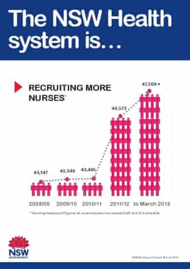
Above: Image Source: NSW. This one from New South Wales, in Australia, shows the increase in the number of nurses - which is for all purposes, factually correct - the only problem is that the visual sense of scale is seemingly very imbalanced, which you don't really realize until you study the infographic for a bit. Four stick nurses represent 43,000 nurses - so why are 28 more stick people used to represent an increase of just 3,000 nurses? Also, the stacked nurses look just plain weird. Why aren't they separated? Why are they standing on each other's heads?
Above: Image Source: designyourway.net.
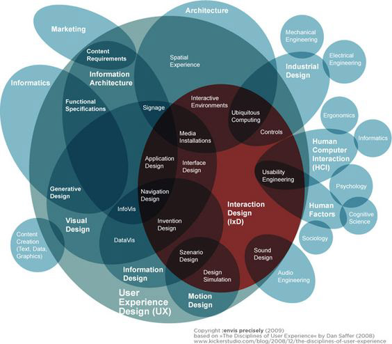
This one, for all intents and purposes, had a good idea. I like that the teal blue makes a sort of bordeaux color when it mixes with the tomato red. The teal blue blobs make a darker teal (marine?) when they overlap. However, there are simply too many subjects here for them ALL to be teal blue. There's nearly 50 concepts that need to be represented- the creator of this infographic was going a step in the right direction but quickly made the error of not providing enough visual differentiation. The viewer takes one look at this infographic and mentally lumps all the blue objects together into one category- even if they're not related. What the creator should have done, is sort concepts into groups (which it looks like they sort of already did)- then choose at least a few other colors that will provide some visual separation. Or, you know, maybe just include less concepts. This is a lot for such a small amount of visual space.
Works Cited:
Knemeyer, Dirk. “Information Design: The Understanding Discipline.” Boxes and Arrows, 15 July 2003, boxesandarrows.com/information-design-the-understanding-discipline/.